

What do you mean by dynamic landing page?
When dealing with page creation, we’re stuck balancing between static and dynamic content. That could come in a variety of flavors, such as a blog that’s completely statically compiled, meaning nothing on the webpage is dynamic, or a serverside rendered application with highly dynamic authenticated visitor details.
Whatever the case, when building any page, we have to think about what can be static or what needs to be dynamic, and when personalizing content, it’s likely that content needs to be dynamic.
We can do this clientside by using JavaScript and clientside requests, but that doesn’t always meet the needs of the application. Like in the instance of creating dynamically generated SEO metadata for use of social cards, where we want each card generated to be based off of that dynamic value.
What are social cards and how do they show up on Twitter or other sites?
Social cards are the big beautiful graphics you see when sharing a link on social media like Twitter or some of the popular chat apps like Slack or Discord.
They’re images controlled by the site owners that often represent what the page is about whether it’s some text or it’s a graphic.
The issue with dynamically generating these is they need to be already defined when the first HTML of the page is requested, particularly using Open Graph meta tags that specify the URL of the image along with other details.
That means we need to take advantage of serverside rendering if we want our social images to be truly dynamic as opposed to something we can generate when building our application.
How can we dynamically generate an image?
While there are several options for how we can tackle this, such as taking a screenshot of a website or using the canvas API, we’re going to use Cloudinary, a media platform that allows us to take any image and transform it including overlaying text and other images.
This will give us the ability to control exactly how we want our image to look based on dynamic values!
What are we going to build?
To see how we can dynamically generate our social media cards, we’re going to use Next.js with serverside rendering to take the dynamic information we want when rendering the page to create a URL we’ll use for our social card.
We’ll do that by creating a new Next.js app from a demo starter I created that allows us to grab a GitHub user’s profile and display it on a page.
Once we have our application, we’ll learn how we can use Cloudinary to generate our dynamic social image by uploading a base image to Cloudinary and overlaying dynamic text.
Then we’ll add that image to our page’s metadata along with a button that will let us pop up a new window to share our page on Twitter.
Disclaimer: I work for Cloudinary as a Developer Experience Engineer.
Step 0: Creating a new Next.js app from a demo starter
We’re going to start off with a new Next.js app using a starter that will give us a website that allows you to enter a GitHub username and see profile details of that user.
Inside of your terminal, run:
yarn create next-app my-landing-page -e https://github.com/colbyfayock/demo-github-profile-starter
# or
npx create-next-app my-landing-page -e https://github.com/colbyfayock/demo-github-profile-starter
Note: feel free to use a different value than
my-landing-pageas your project name!
Once installation has finished, you can navigate to that directory and start up your development server:
cd my-landing-page

yarn dev
# or
npm run dev
And once loaded, you should now be able to open up your new app at http://localhost:3000!
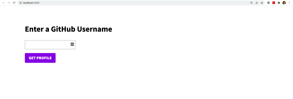
To get an idea of how this page currently works, we can open up the code and head over to first the homepage at src/pages/index.js which includes a form where when submitted, takes the input value and redirects the visitor to a new page.
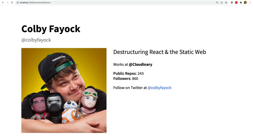
That page is located at src/pages/user/[username].js which is a dynamic route, which takes the username and uses the data fetching method getServerSideProps at the bottom of the file, reaches out to the GitHub API, gets the user’s information, and passes it to the app to display on the page.
We can test that out right in our app, where if we enter our GitHub username (or mine colbyfayock), we can see some of our profile info!
Step 1: Creating and uploading a base image for a social card to Cloudinary
To get started, we want to start building the image that we’re going to dynamically generate.
I put together a design in Figma that I want to use as the basis of my card.

Note: All GitHub assets including the planet graphic is from github.com
The first thing we need to do is separate out the static parts from the dynamic parts. In my card design, the static parts are pretty much the background and the GitHub logo, where the dynamic parts are my avatar, name, username, bio, follower count, and repo count.
So using this example, I’m going to hide all of the dynamic parts and save the image with only the static bits, which I’ll use to upload to Cloudinary for my social card.

Tip: feel free to use the image above to follow along!
Next, with our base image, we want to upload it to Cloudinary, where we’ll be able to use it to generate our social cards.
Once logged in to cloudinary.com, head over to your Media Library, select the Upload button at the top right, then drag or select your card image to upload.
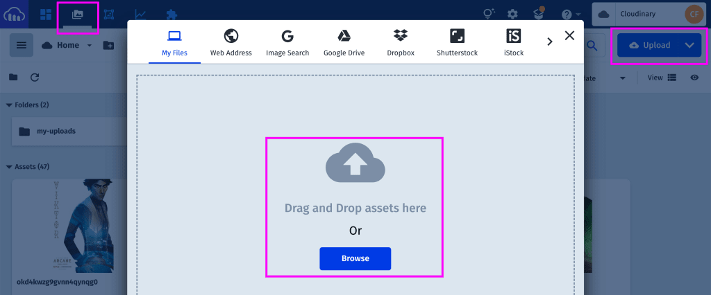
Once selected, the image will upload, where you can then navigate to the asset by clicking the image’s ID or selecting Manage from the dropdown.
On that page, we’ll find our image’s Public ID right at the top, which is what we’ll use later when reference our image to generate a dynamic card.

But now that we have our base image uploaded and ready to go, we’re ready to start generating our dynamic image with Cloudinary!
Step 2: Installing and using the Cloudinary Node SDK to generate social card images
We have a few options for how we generate our image with Cloudinary, but given we’re working in JavaScript and particularly, we’ll be working in node to generate our URL via the getServerSideProps data fetching method, we’ll use the Cloudinary Node SDK.
To get started, head to your terminal, where we’ll first install the Cloudinary SDK by running:
yarn add cloudinary
# or
npm install cloudinary
Next, we want to import Cloudinary into our application.
At the top of our user page located at src/pages/user/[username].js add:
import { v2 as cloudinary } from 'cloudinary';We particularly are importing v2 of the Cloudinary SDK, but we’re renaming it as cloudinary so it makes a bit more sense when using it in our app.
With Cloudinary imported, we can start configuring it to use.
The first thing we need to do is configure out Cloudinary Cloud Name with the SDK.
Scroll down to the bottom of the file where we’ll find getServerSideProps and right underneath the user constant add:
cloudinary.config({
  cloud_name: '[Your Cloud Name]'
});
In the above, you’ll want to replace the value of cloud_name with your Cloudinary Cloud Name. You can find this value right at the top of your dashboard when logged in to Cloudinary under Account Details.

Note: Remember to use your own Cloud Name from your own Cloudinary account!
Now with the SDK configured, we can start to generate our images.
Under the config, add:
const cloudinaryUrl = cloudinary.url('github-social-share-card-background_xfp2m8', {
  width: 1012,
  height: 506,
  transformation: [
    {
      fetch_format: 'auto',
      quality: 'auto'
    }
  ]
});
This will use the cloudinary.url method to generate an image URL based off of our settings.
We’re including a width and height in a 2:1 ratio based off of Twitters Summary Card with Large Image and a transformation where we’re using basic Cloudinary features to automatically optimize our image and serve it in a file format best suited for the requestor.
Additionally, similar to the Cloudinary Cloud Name, you’ll want to use your Public ID that you created in Step 1 when uploading the base image to Cloudinary.
This ID needs to come from your account otherwise you won’t have access to the image.
For instance, in Step 1, my Public ID was github-social-share-card-background_xfp2m8.
That means, my cloudinaryUrl snippet will be:
const cloudinaryUrl = cloudinary.url('github-social-share-card-background_xfp2m8', {We’ll also pass this cloudinaryUrl as a prop into our Next.js application so that we can use it in our app.
In the return statement add the prop with:
return {
  props: {
    user,
    ogImageUrl: cloudinaryUrl
  }
}
Tip: I’m using
ogImageUrlas the prop name instead ofcloudinaryUrlto describe the general use case rather than the specific creation method of the URL
We can then make that prop available in our page component with:
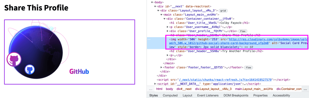
export default function User({ user, ogImageUrl }) {And finally give the ability to preview our image inside of the app by adding a new sharing section with:
<h2 className={styles.header}>Share This Profile</h2>

<img width="506" height="253" src={ogImageUrl} style={{ border: 'solid 2px blueviolet' }} alt="Social Card Preview" />
Note: I made the card half size to avoid it being huge as a preview in the app along with a border so we could clearly see the defined image.
Where then, we can see our image rendered right to the page straight from Cloudinary.

You can even right click or inspect the image to view the URL where you’ll see the image coming right from cloudinary.com!
Next we’ll learn how to dynamically add our user’s GitHub account details on our image.
Step 3: Dynamically adding images and text overlays to a Cloudinary image
Now that we have our basic image set up, we can start to transform it by dynamically adding our GitHub user’s avatar and text layers on top.
If we remember from Step 1, my design had 1 dynamic image and 4 different text nodes which were:
- Avatar (image)
- Name
- Username
- Bio
- Stats (# Followers, # Public Repos)
Since we have all of that data inside of getServerSideProps from our GitHub request, we can add those right on top of our existing Cloudinary image.
To do that, we’re going to use transformations and in particular, we’re going to add overlays.
We already have a transformation array from the previous step, so we’ll be able to add our new transformations right to that array.
First up is the avatar.
The transformation array works by keeping track of which transformation objects are added and in which order to be able to correctly add new overlays and transformations to those overlays.
For instance, we can imagine this with pseudo-code like:
trasnformation: [
  Image Overlay,
  Layer Settings for Image Overlay,
  Text Overlay,
  Layer Settings for Text Overlay
]
So with that in mind, let’s add our first overlay which will be our avatar image.
First we need to specify our image overlay. Add the following to the transformation property:
{
  overlay: {
    url: user.avatar_url
  }
}
We’re defining a new overlay by using a remote URL, which we’re getting from our GitHub user object.
If we refresh our app, we should now see that avatar right on top of our image!
But we don’t want it in the center like that, we want it positioned like it was in the design.
So after that overlay configuration, add another object to the transformation array:
{
  flags: 'layer_apply',
  width: 250,
  height: 250,
  gravity: 'north_west',
  x: 150,
  y: 95
}
Here we’re applying transformations to the previously added overlay by specifying the layer_apply flag.
In it, we’re setting the width and height just like inside of the design document as well as setting the position. The gravity property tells cloudinary where to base the positioning off of, so because we specify north_west, we’re saying we want the positioning to be based off of the top left corner, which is then where the x and y values are relative to per the design.
Now that’s looking better in terms of positioning and size, but the design had our image in circle.
So to finish off our avatar image, we can apply a radius to that previous configuration object we added like:
{
  flags: 'layer_apply',
  width: 250,
  height: 250,
  gravity: 'north_west',
  x: 150,
  y: 95,
  radius: 250
}
And now we have a circle!
As a quick checkpoint, here’s what we have so far:
transformation: [
  {
    fetch_format: 'auto',
    quality: 'auto'
  },
  {
    overlay: {
      url: user.avatar_url
    }
  },
  {
    flags: 'layer_apply',
    width: 250,
    height: 250,
    gravity: 'north_west',
    x: 150,
    y: 95,
    radius: 250
  }
]
So now we have our image overlaid, but how about our text?
This will work pretty similarly to our image overlay, except we’ll be configuring it as text rather than an image.
To start off, let’s add some text by adding a new overlay and layer settings object to our transformation array:
{
  color: '#4D57F6',
  crop: 'fit',
  width: 432,
  overlay: {
    font_family: 'Source Sans Pro',
    font_size: 60,
    font_weight: 'bold',
    text: user.name
  },
},
{
  flags: 'layer_apply',
  gravity: 'north_west',
  x: 506,
  y: 80
}
We’ll notice that we’re similarly using the overlay property, but we’re passing a few additional fields that relate to text. We’re also passing in the text property which as it sounds, is the actual text we want to overlay.
Now the tricky thing here to point out is the use of the crop property and only explicitly setting a width. Because of the nature of dynamic text, we don’t know how long that text will be, so we want to make sure that we do two things here: prevent our text from overflowing to the right and allowing the text to drop down to a new line.
The width property tells Cloudinary it should only extend 432 pixels, but the crop property is telling Cloudinary we want our text to fit in, and since we’re also setting a font size, Cloudinary will then drop that value down.
Tip: you can test this out by hard coding a longer value!
But when we open it up in our browser, we should see our text!

Next, we want to add more text.
Before we proceed, let’s reference back our pseudo-code from earlier, where when we’re adding our overlay and configuration, we’re imagining it like:
trasnformation: [
  Image Overlay,
  Layer Settings for Image Overlay,
  Text Overlay,
  Layer Settings for Text Overlay
]
This works really well if we’re adding a bunch of independently configured layers.
But we’re dealing with multiple text nodes where if our first line drops down to two lines, we want the rest of it to drop down and naturally flow.
So we’re going to take advantage of nesting within the Cloudinary API, where we can have our primary text node (which we created already) and nest more text with it.
To do this, we add our new overlays and their own configurations between the overlay and the overlay’s layer settings. You can imagine this like:
trasnformation: [
  Image Overlay,
  Layer Settings for Image Overlay,
  Text Overlay 1,
    Text Overlay A,
    Layer Settings for Text Overlay A,
    Text Overlay B,
    Layer Settings for Text Overlay B,
    Text Overlay C,
    Layer Settings for Text Overlay C,
  Layer Settings for Text Overlay 1
]
Note: In the above, I added the indentation to help illustrate how this works.
With this in mind, let’s first add our GitHub username.
Between our overlay and layer settings add:
{
  color: '#627597',
  crop: 'fit',
  width: 432,
  overlay: {
    font_family: 'Source Sans Pro',
    font_size: 34,
    font_weight: 'semibold',
    text: `@${user.login}`
  },
},
{
  flags: 'layer_apply',
  gravity: 'north_west',
  y: 'h + 10'
}
The resulting text overlay code should look like:
{
  color: '#4D57F6',
  crop: 'fit',
  width: 432,
  overlay: {
    font_family: 'Source Sans Pro',
    font_size: 60,
    font_weight: 'bold',
    text: user.name
  },
},
{
  color: '#627597',
  crop: 'fit',
  width: 432,
  overlay: {
    font_family: 'Source Sans Pro',
    font_size: 34,
    font_weight: 'semibold',
    text: `@${user.login}`
  },
},
{
  flags: 'layer_apply',
  gravity: 'north_west',
  y: 'h + 10'
},
{
  flags: 'layer_apply',
  gravity: 'north_west',
  x: 506,
  y: 80
}
Like our first text overlay, we’re configuring how we want our text to look and passing in a dynamic value.
The only thing that’s a bit different here is the value we’re passing in for y. Cloudinary accepts more than simple static values, it also allows us to pass in arithmetic expressions, so our value of h + 10 is saying that we want to take the current height of our group which includes our first text layer and add another 10 pixels to it for a little spacing, which will give us our y value.
When we reload our app, we can now see our username right below our text.

We can even see if we manually make our first line drop down to two lines, we’ll see that it flows right along with it and drops down!
But now we can apply the exact same method to add both our user’s bio along with some stats, by placing the following after our username overlay we just added but before our original overlay’s layer settings object.
{
  color: '#24292F',
  crop: 'fit',
  width: 432,
  overlay: {
    font_family: 'Source Sans Pro',
    font_size: 36,
    font_weight: 'regular',
    text: user.bio,
    crop: 'fit'
  },
},
{
  flags: 'layer_apply',
  gravity: 'north_west',
  y: 'h + 18'
},
{
  color: '#24292F',
  crop: 'fit',
  width: 432,
  overlay: {
    font_family: 'Source Sans Pro',
    font_size: 28,
    font_weight: 'semibold',
    text: `${user.followers} Followers    ${user.public_repos} Public Repos`,
    crop: 'fit'
  },
},
{
  flags: 'layer_apply',
  gravity: 'north_west',
  y: 'h + 24'
},
Tip: check out the final configuration over on GitHub.

To illustrate how the text layers came together a bit, here’s a little visual explainer.

But now our social card is ready to be shared with the rest of our page! So let’s add a way to share it.
Step 4: Adding open graph metadata for SEO and social sharing
The goal of this page is that when someone shares the URL on social media, Twitter or other social platforms will scrape the page, find our social image, and use that to display in the feed.
But this process doesn’t happen automatically, we need to use open graph tags and specialized network-specific tags to make this happen.
So to start, let’s set up our open graph tags.
At the top of our page component inside of src/pages/user/[username].js we should see a <Head> component.
The Head component is created and maintained by the Next.js team to allow developers to dynamically add code right into the document’s head.
We can see we’re already defining a title and description, which are pretty standard, but we want to also add open graph metadata.
So first, add the following right after the title and description:
<meta property="og:title" content={`${ user.name } - GitHub Profiler`} />
<meta property="og:image" content={ogImageUrl} />
<meta property="og:image:secure_url" content={ogImageUrl} />
<meta property="og:image:width" content="2024" />
<meta property="og:image:height" content="1012" />
First, we’re re-defining our title with open graph. While most of the times websites will fallback to the document’s <title> tag, it’s best practice to redefine it as open graph.
Next, we’re defining our open graph image, where we’re defining both an og:image as well as an og:image:secure_url.
From experience, some sites won’t work without having both, even if you provide a secure URL using https for the og:image tag, so best practice is to define both to make sure you’re covered, but then we also define the width and the height to make sure we’re declaring the size of our image.
Now we won’t be able to test this until we actually publish it to a live address, as social networks and websites won’t be able to see our local development servers, so before we push this out, let’s also add Twitter-specific tags.
<meta property="twitter:title" content={`${ user.name } - GitHub Profiler`} />
<meta property="twitter:image" content={ogImageUrl} />
<meta property="twitter:card" content="summary_large_image" />
Similar to open graph, we’re redefining our title and image. This time though, we’re adding a twitter:card property which states the type of “card” we want to use on Twitter. We want our image to show up big in feeds, so we use summary_large_image or the Summary Card with Large Image.
Tip: notice how we’re defining our title multiple times? You can take this a step further by customizing how your title looks depending on the site that uses it, such as “Colby Fayock – GitHub” for the default title and “Check out Colby Fayock on GitHub” just for Twitter.
But now we can test this out by pushing our changes out to our hosting platform.
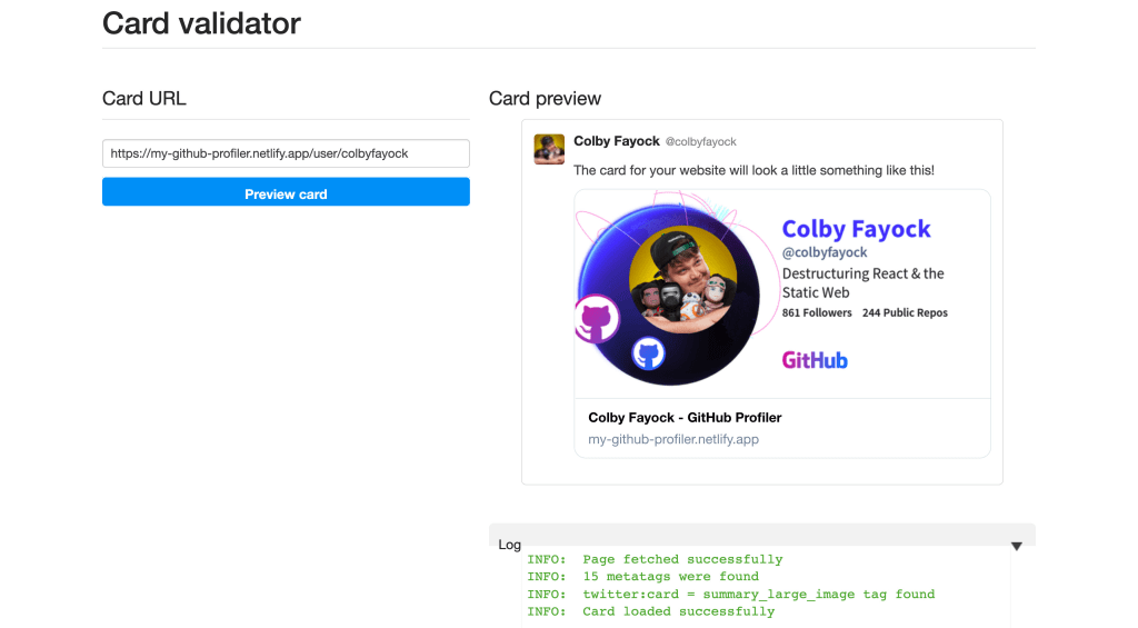
Once we do, we can use tools like the Twitter Card Validator to see how our new social card looks or we can simply share it on Twitter!
Note: Depending on the platform, the page may be cached. If it’s not showing up right away, first make sure that the tags are on the page then use tools like the Validator to refresh it.
Step 5: Adding a share button to pop up a Twitter tweet dialogue
Finally, we want to make it easier for our visitors to actually share our page, so we can set up a new button where when clicked, opens a new dialogue that makes it easy for those already logged in to Twitter to tweet.
To do that, we’re going to use the Twitter Web Intent API which let’s use define a URL to Twitter with a predefined tweet.
Basically the way it works, is we start off with our Twitter Web Intent URL, then add URL parameters, that allow us to configure that message. We’ll then open that in a popup using the Window.open method.
So to start, we first want to add a button which we’ll use to trigger our sharing dialogue. If you’re following along, we already have the Button component imported, so we’ll use that, but if you’re on your own, you can use a standard HTML button.
Under our share image inside src/pages/user/[username].js add:
<p>
  <Button onClick={handleOnTweet}>Share on Twitter</Button>
</p>
As we can see we’re also defining an onClick handler, so we want to define that function as well.
At the top of the component before the return statement add:
function handleOnTweet(event) {
  event.preventDefault();
}
If we check this out in our browser, we can see our button.

And if we try it out, we’ll notice it doesn’t do anything yet, which is expected, especially given we’re preventing the default functionality from happening.
So now we want it to pop up a new window with a Tweet.
To start, we’re going to use window.open to pop open the window. Inside the handleOnTweet function add:
window.open(`https://twitter.com/intent/tweet`, 'share-twitter', 'width=550, height=235');If you’re logged in to Twitter and test out the button, it’ll open a little window with a new Tweet editor, currently with nothing in it. If you’re not logged in, it will first ask you to do so.

But next, we want to add a default message to pop up. We can do that by adding a URL paramter to our URL as ?text= with our message as the value.
We’ll do that by adding a new constant called message that we pass in as the value.
const message = `Check out ${user.bio}'s GitHub profile!`
window.open(`https://twitter.com/intent/tweet?text=${encodeURIComponent(message)}`, 'share-twitter', 'width=550, height=235');
In addition to passing in the message value, we’re using encodeURIComponent to make sure we escape any characters that are not supported in a URL, that way it will safely open.
We’re also dynamically passing in our user’s username to the tweet.
Now finally, the point is to share our current page, so we need to add our URL!
If you know the website’s host, you can hard-code it into the following, but to make sure it works on any domain that’s publicly available, we’ll set it up to be dynamic based on what the browser knows of the page.
const url = `${window.location.origin}${window.location.pathname}`;
const message = `Check out ${user.login}'s GitHub profile! ${url}`
window.open(`https://twitter.com/intent/tweet?text=${encodeURIComponent(message)}`, 'share-twitter', 'width=550, height=235');
Here we’re using the browser’s window.location to grab both the origin and the pathname and appending that URL to the end of our message.
Now if we try this out using our local development server, it’s not going to work, as Twitter doesn’t have access to your local server.
But if we save those changes and publish them to our project, we should now see that when we click our share button, we can see our new tweet popup with our message and URL.

We can even see if we expand the window a bit our dynamically generated image based on the GitHub profile!
What else can we do?
Generate social card based off of custom data
While we used a GitHub profile to generate our social card, we can really use any kind of data.
Like one of the examples mentioned in the intro, we’ve seen conferences like Next.js and React dynamically generate social cards when people are sharing their “ticket”.
We can make any requests for personalized data in getServerSideProps to add dynamic content to our cards!
Use different network profiles
We’re not stuck with only using GitHub for our profile info, we can use any social network!
We can even do this dynamically, just like we added our avatar on top of our image as an overlay, we can add the GitHub logo dynamically.
Learn more about pragmatically generating images with Cloudinary
Beyond social cards, we can do a lot of cool things with Cloudinary, such as generating thumbnails that use AI to detect where a face is, cropping it to that location.
Learn more about How to Create Thumbnail Images Using Face Detection with Cloudinary.