Disclaimer: This post is sponsored by Codux. Learn more about sponsored content.
What is Codux?
Codux is Visual IDE that allows you to use a UI to visually build React applications including creating components, editing them, styling them, and customizing component UI state all with full Typescript integration and support.
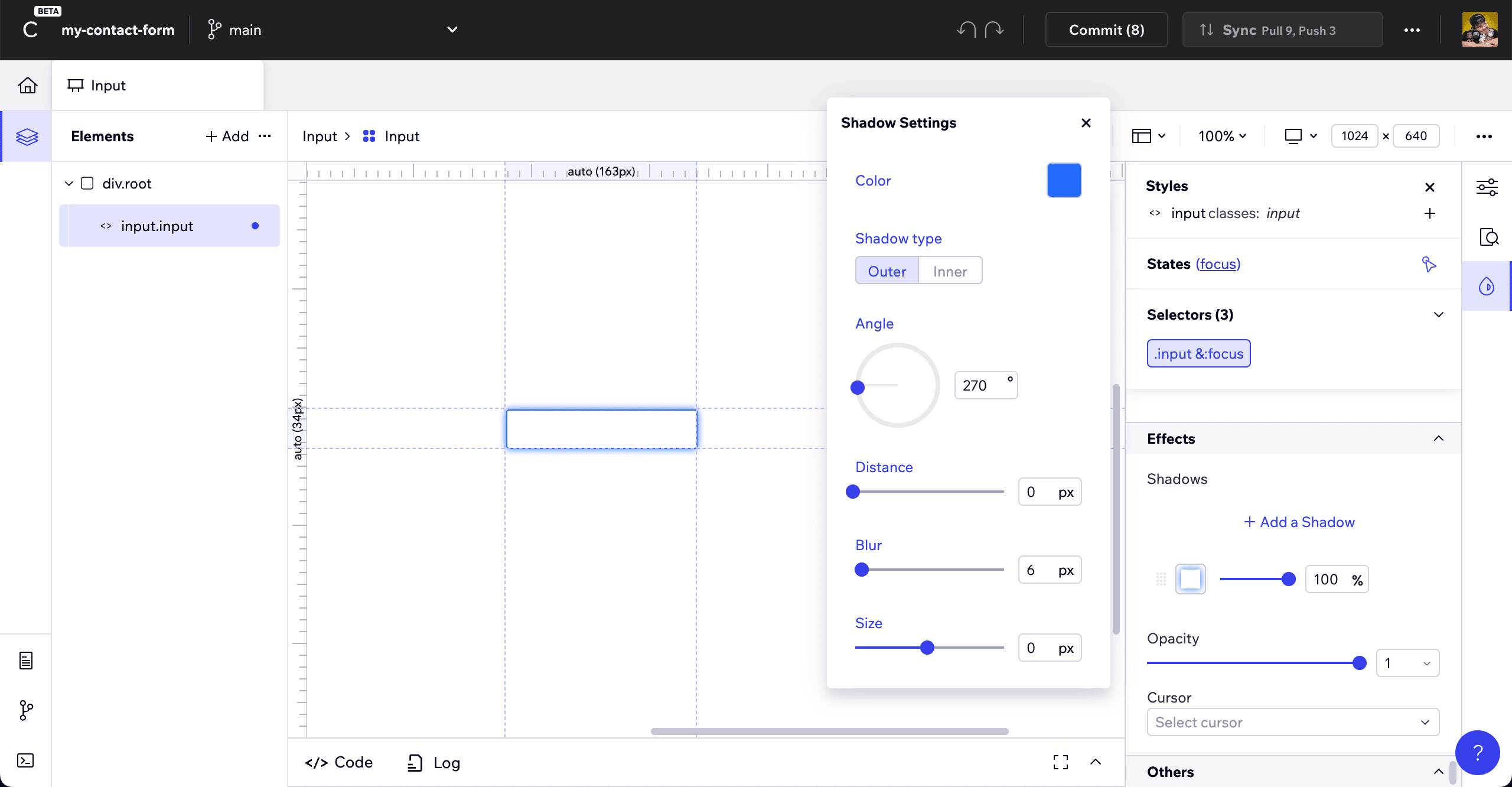
But this is less like Figma that gives you static code output that you can copy and paste and more like an IDE playground, where all of the changes you make inside of Codux are actually code changes, making realtime updates to your application.
How does the Visual IDE work?
When creating or managing a project in Codux, all of your components are sucked into the Visual IDE based on the project configuration, or by default if you’re starting your app from Codux.
Once they’re all there, you can manage your tree of elements by dragging and dropping them anywhere, adding new components, managing props, and styling the different elements elements, all with a Canvas that shows the state of your work as if you’re working on it in your browser.
Where does Codux fit in?
I’m a developer and I love to code. I love writing CSS and I love designing my applications.
But there’s a big gap between writing CSS and how it fits into my development flow.
I end up using Chrome DevTools to “design in the browser” but that’s not that great of an experience, but to have a somewhat similar experience, with a friendlier to use UI, AND actually updates my code in realtime? That’s Codux.
And this isn’t a tool just for developers, coming from the other side, maybe you’re a designer who want to make code changes or start learning how to code with a lower barrier to entry.
Codux fits in across the entire design to development spectrum, helping to bridge that gap.
What are we going to build?
We’re going to use Codux to start a new React application from scratch, complete with Typescript for you TS fans out there.
Once inside, we’ll see how we can use Codux to create all the components we need for a working contact form and design them to look exactly how we want.
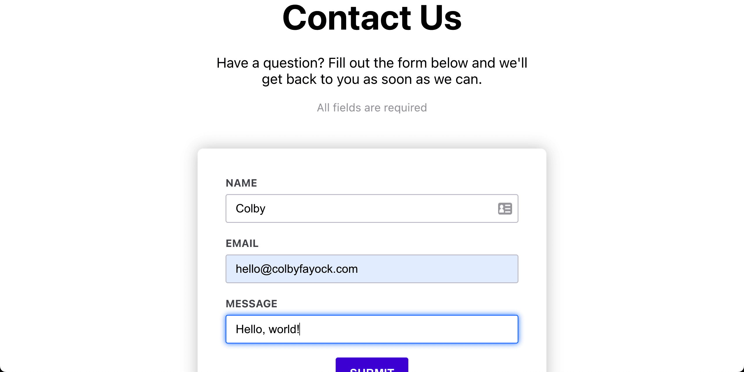
After we have our UI put together, we’ll wire things up inside of a code editor to add event handlers and API requests to take our form UI to fully functioning, deployed to Netlify!
Note: before getting started, you’ll need to download and install Codux over at codux.com
Step 0: Creating a new React app with Codux
Getting started, the first thing we want to do is create our core application.
Once you’ve downloaded, installed, and opened up Codux, we’ll be greeted with the ability to add a new project or check out a tutorial project.
Tip: You can even find more options like importing local projects or from GitHub in the Add Project menu in the top right!
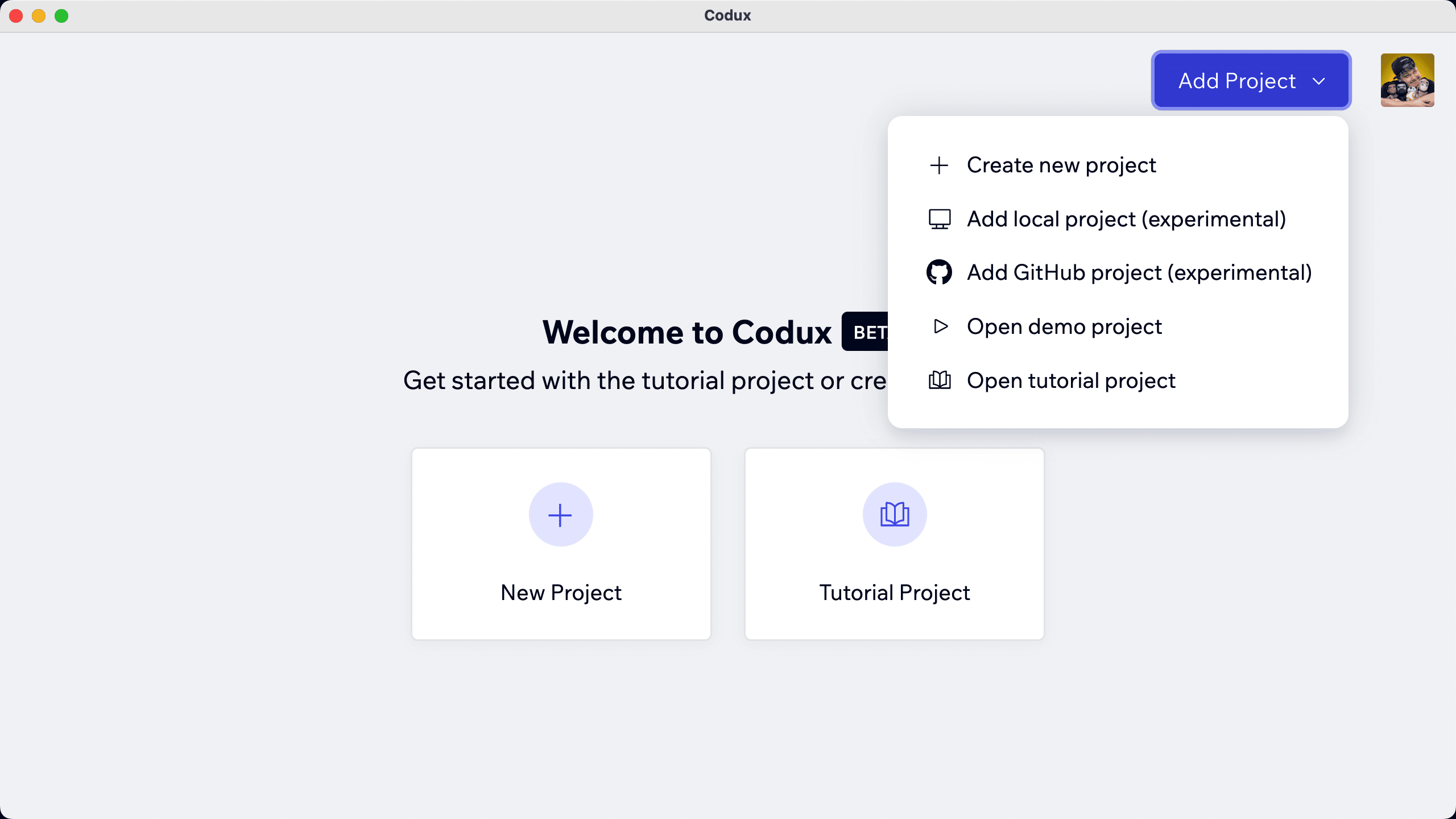
Click New Project which will prompt you with a few standard questions including the name of the project and where you want to save it as.
Tip: Think of the name and the location like you would any other code project, where any time I clone or create a new project, I keep my projects inside of /Users/colbyfayock/Code on my Mac
You’ll also notice we have the ability to select a Styling Solution though I’m a fan of SCSS & CSS Modules, so let’s keep that for now and click Create.

At this point Codux will scaffold your new application, leaving us with one thing left to do, which is running the configuration and installation steps, which Codux will prompt you to do.

Click Run and once complete, click Close where we’ll now have our brand new React application!
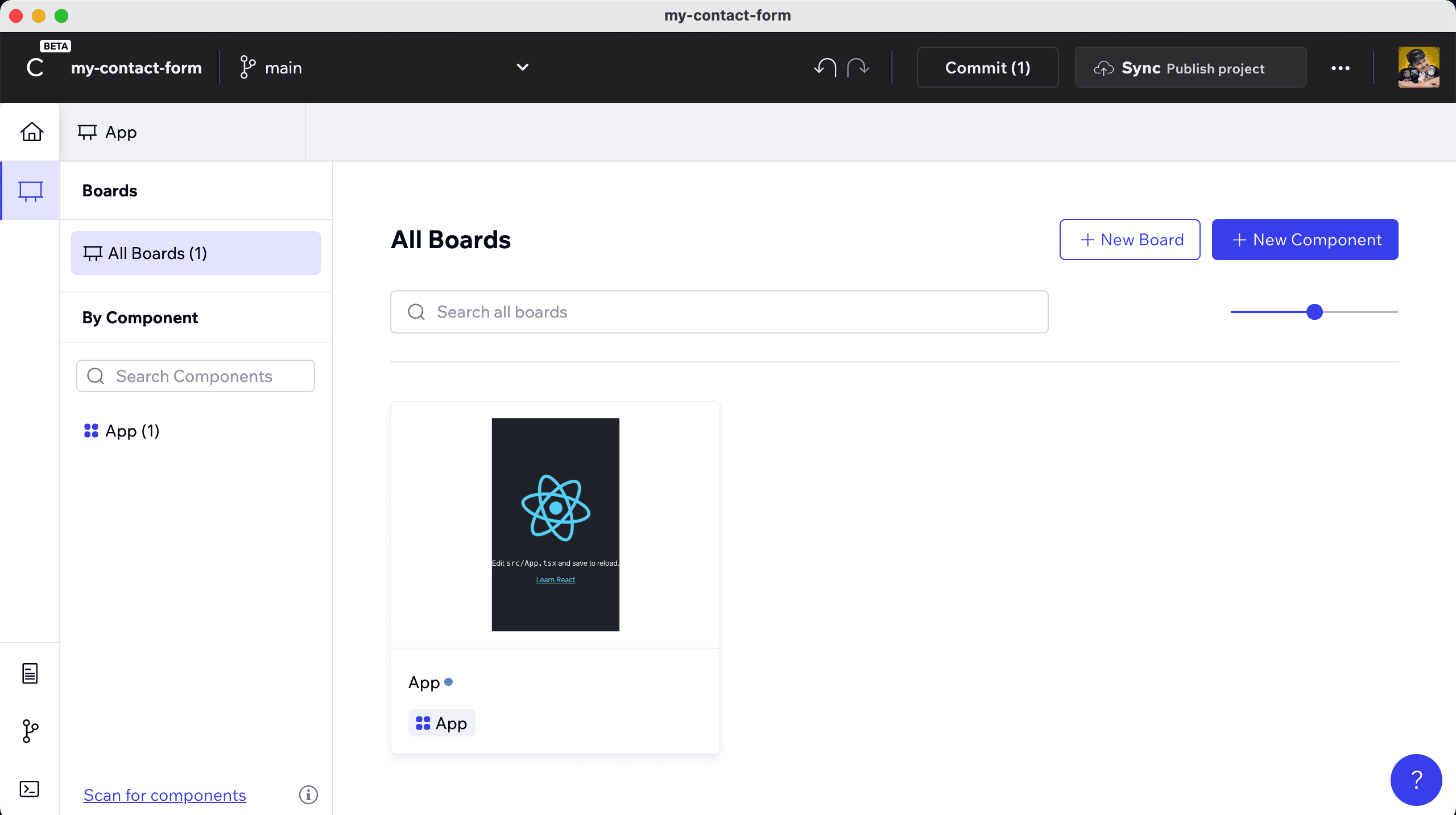
From here, feel free to poke around a little bit before we dive in.
Codux gives us a starting point with a single component of App, which technically is the Create React App application.
Conceptually, the Codux layout will give us Components and Boards for our components, where our Components are what they sound like, but Boards gives us a way to visually edit different states of each of our components.
Tip: If you’re familiar with Storybook, you can think of a similar concept, where we have our Components and Stories (or Board) for each Component.
The cool thing about how Codux works though, is everything that’s happening behind the scenes is literally making code changes, just like we would in a standard IDE.
You can see exactly how this is working by opening the project up in your standard editor and even running the project locally by navigating to your project from the terminal such as:
cd my-contact-formAnd running:
npm run startWhere once loaded in our browser, we see our new React app!
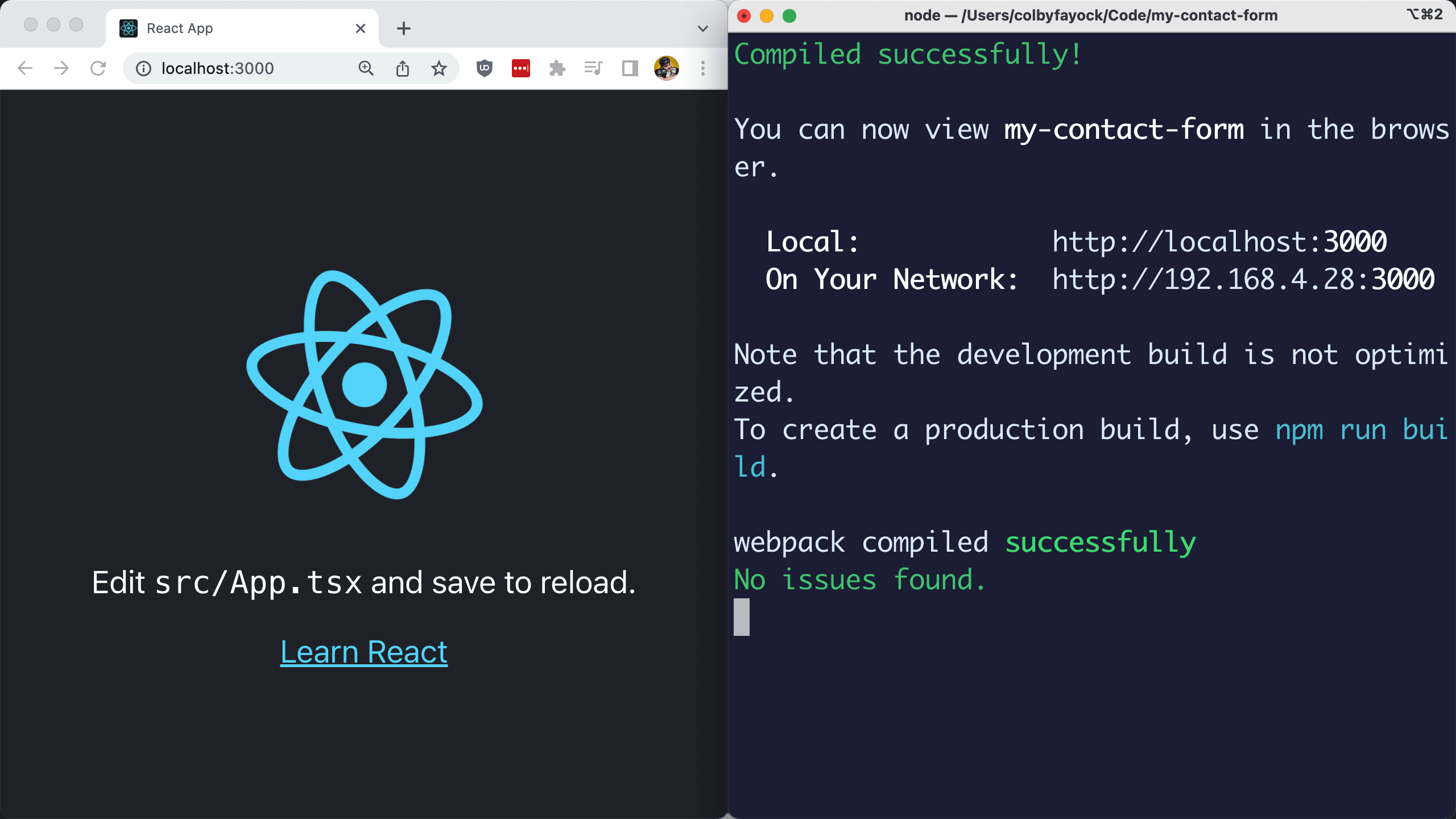
Tip: You can even keep this app open the whole time we work in Codux and see the changes live in your browser!
Step 1: Creating a new React form in Codux with custom Components
Digging in, the first thing we need is an actual form.
To see how this works, we’re going to work through this in a few steps including:
- Cleaning out starter code
- Adding some standard elements
- Turning those standard elements into custom Components
- Adding props
Cleaning out starting code
Before we create our form, we want to set ourselves up with a clean start.
Select the App Component and board, which will bring our Canvas giving us our first interaction point with our Component.
On the left, we’ll see an Elements list, which is going to show the tree of our Components and the children inside. This first view gives us a look at our Component inside of the bounds of our Window and gives us some options for how we preview it.
But we want to edit the Component, which will serve as the core of our application, so double click App, which will take us to our Component editor.
Here we can see the elements that make up our existing application, including the React logo, some text, and a link.
If we select any one of these, we can navigate using the panels on the right.
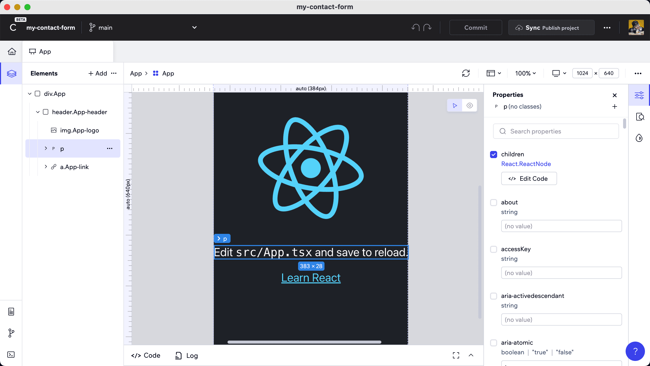
This gives us inside into the properties being applied to the elements and the styles, which we’ll come back to later.
For now, we want to remove all of the elements in the Header, including the Header itself, so we can start creating our Form.
Hover over the header element, select the three dots icon ... and click Delete element.
Now we have our blank canvas, so let’s start building our form.
Adding a new form and inputs
First, we need to add our form.
In the Elements panel, we’ll see a Add button where when we select it, we’ll see an Add Elements panel which a lot of different options.
This is how we can select whatever elements (or in the future components) we want to add to the UI.
In the search bar, look for “form” and we’ll see two options including Form (notice the capitalization of “F”) which gives us a basic form to start from as well as a form (notice the lowercase “f”) which gives us the actual HTML element form.
Let’s build our form from scratch, so click and hold the form element and drag it to the Elements list, dropping it under our div.App.
Next, we need form inputs, so we’re going to do the same thing, except we’re going to search for “input” and drag in the input component to our form.
We can do the same thing by searching for “label” and adding it above our input, which will allow us to specify what the input is for.
Once you add that though, you might be wondering, how do I add text?
When adding a label, we’re adding an HTML label element, which requires text as a child, not as a property, so we need to also search for “text”, where we’ll find “Raw Text”, which we can drag inside of the label.
After adding the raw text, you should now see a Text option in the Properties panel where we can specify the input, such as “Name”.
At this point we should actually be able to visually see our input and label in our app!
This shows us how easy it is to add any element we want to our page.
But before we go too much further here, we don’t want just one input and label, we want three for our form, including name, email address, and a message.
So before we spend too much time customizing these elements, let’s instead create a custom Component for our input and our label.
Creating custom Input and Label Components for a React form
To create a new Component, we need to first navigate back to the Home dashboard by clicking the little house icon on the top left of the Codux app.
Once there, we should still see just our App component along with an updated preview of our app.
But we should also see the New Component button on the top right where upon clicking it, we get some options for setting up our new Component including the Component’s name, the board name (defaults to the Component name), a template if we have any, and some advanced settings.
Let’s go with Input for our first Component and board name, then click Create.
Codux will drop us into our new Component viewer, where similar to earlier when we opened our App, we can double click into the Input where we have the editor.
Here we start off with a text element, but we don’t actually need that, we need an input.
So using what we already learned, let’s:
- Delete the text node
- Add an input node
And now our component should be ready to use, so navigate back to our App by selecting the App Component tab in Codux or going to the Home dashboard and selecting App.
Once back inside our App Component editor, we can add our Input component just like we did the other elements.
Select Add under elements and search for Input, only this time select Local Components from the search sidebar where we’ll see our Input.
Delete the original input and drag in our new Component.
Configuring type-checked props for a Component
Now when thinking about Components, we need to also think about Component props.
With an input, we need to be able to specify things like the name attribute, which is important for actually using the form data.
This brings up a new concept, where to add and manage props, we need to break out into the code editor, which Codux provides at a basic level right inside the app.
To do this, when inside of the Input editor, hover over either the div.root or input element until you see the three dots ... then select View Code from the dropdown.
A code editor will pop up at the bottom of the page, where we’ll see not only the component definition, but the interface where we define the props and the types.
Let’s update the interface to include another prop for name, add it to our component props, and finally apply it to our component:
export interface InputProps {
    className?: string;
    name?: string;
}

export const Input = ({ className, name }: InputProps) => {
    return <div className={`${styles.root} ${className}`}>
        <input name={name} />
    </div>;
};
Now, we can apply the prop to our component, so head back to App, select the Input component, where now you’ll see the name option under the Properties panel, where you can specify the name like “name” or “email”.
Now let’s do the same thing with our label and create a new component.
Create a new component called Label and add the label element.
The difference this time is how we add our dynamic Component, where with Input, we can use a simple prop to control the text, but instance, we want to use the children that would be nested inside of our Label, giving us more flexibility.
To do this, we want to again click View Code on our Label’s label element, then adjust the component and interface to be:
export interface LabelProps {
    className?: string;
    children?: JSX.Element | Array<JSX.Element|string> | string;
}

export const Label = ({ children, className }: LabelProps) => {
    return <div className={`${styles.root} ${className}`}><label>{ children }</label>
    </div>;
};
Here we:
- Added the
childrenprop to our interface - Added
childrento the component argument - Added
childreninside of the label element
But now, let’s drop the new Label component into our App and we can add Text nested inside of our Label, which we can then customize for our Input.
Tip: when dealing with Inputs and Labels, it’s important to specify which input the label is “for”, helping with accessibility and usability. Try adding an htmlFor attribute for the label that corresponds to the same id attribute of the input.
Adding a submit button
And now we need a way to submit the form, so let’s add a button!
We can pretty much do the same thing we did for our Label component, only we’re going to use a button instead.
Let’s create a new component called Button and inside drop an actual button.
Like before, we want to set this button up to pass in the children to the component, so we’ll use the following code:
export interface ButtonProps {
    className?: string;
    children?: JSX.Element | Array<JSX.Element|string> | string;
}

export const Button = ({ children, className }: ButtonProps) => {
    return <div className={`${styles.root} ${className}`}>
        <button>{ children }</button></div>;
};
And once ready, drop it into the App, nest some text such as the word “Submit”, and we’re ready to go!
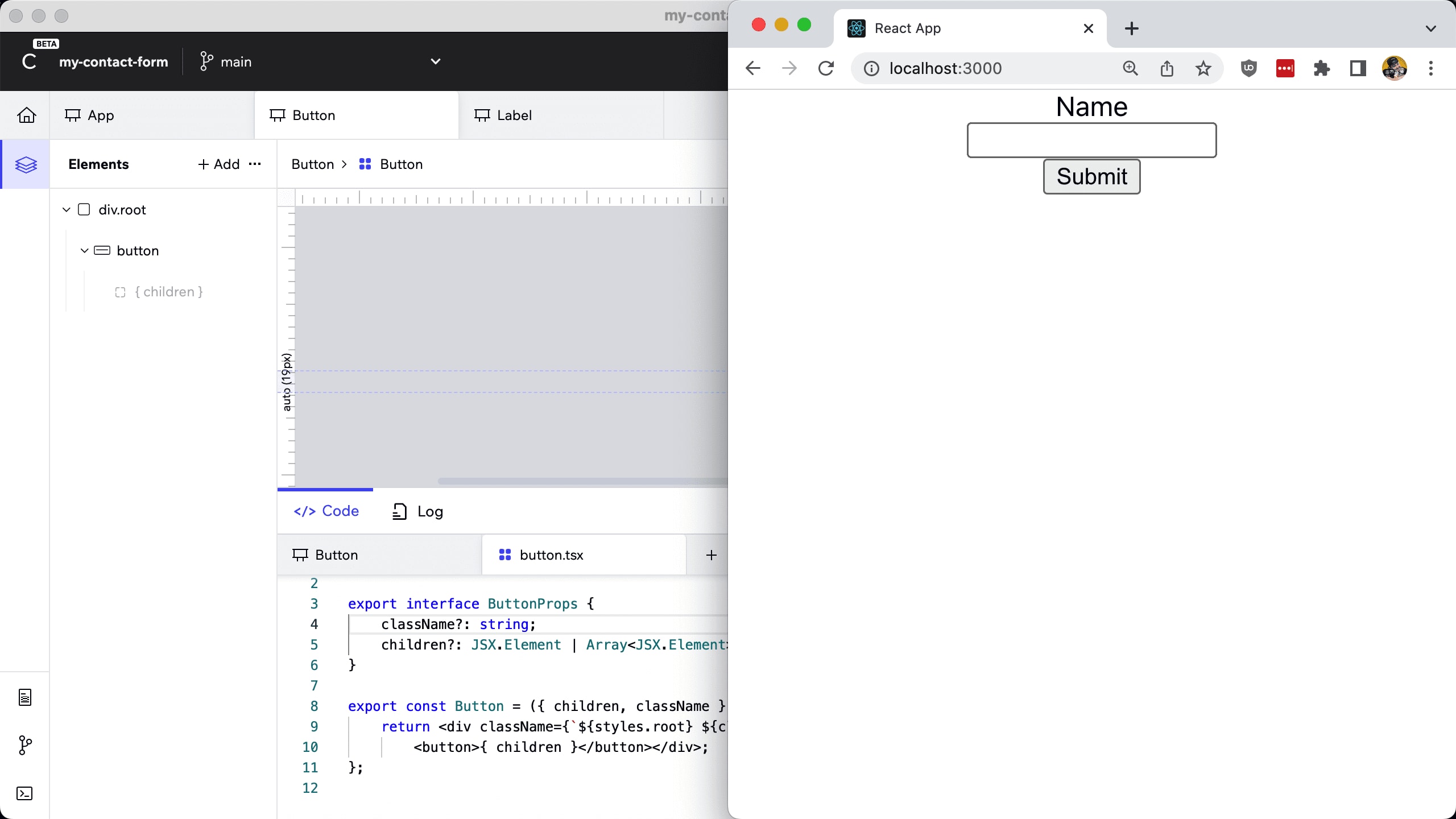
Wrapping up the form
At this point, we can start creating our other form elements, including adding a field for email and message, or whatever fields you’d like to add for your contact form.
Now the awesome thing, is remember earlier we talked about how we can immediately preview this in the React app itself?
If we head back to our terminal and spin up our local development server with:
npm run startWe’ll be able to see our application including all of our form inputs!
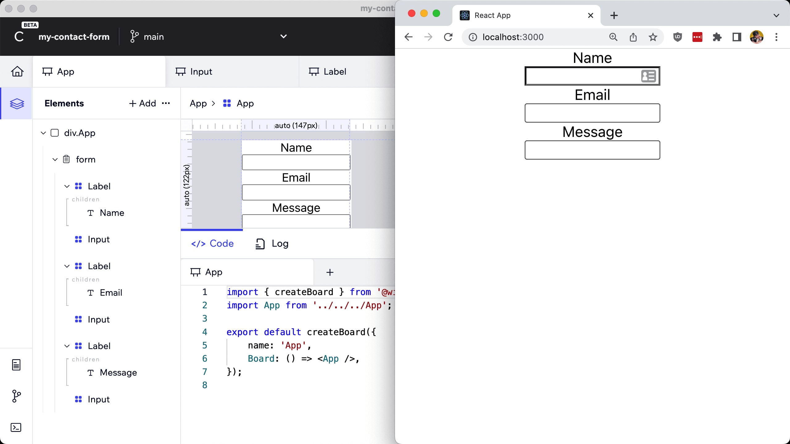
Better yet, we can see exactly what all Codux changed by checking out our git history.
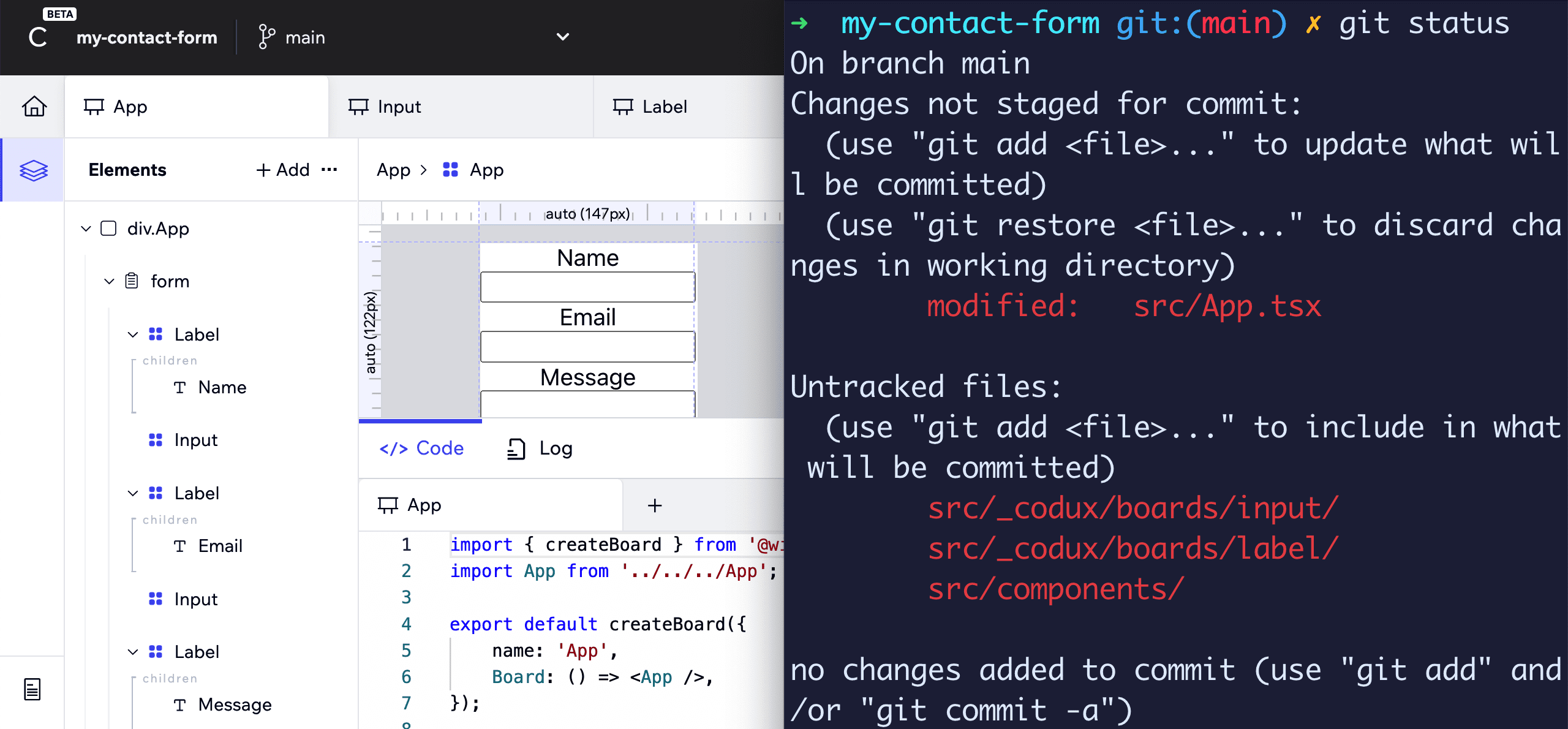
This is powerful because Codux is actually making code changes when you’re visually editing, not some kind of hacky change management, giving you full visibility into the changes and a great way to have an escape hatch if you need to dig in manually.
And what do we need to do with our code changes? Check them in to Git of course! Which we’ll do in the next step.
Step 2: Publishing a Codux React project to GitHub and Deploying to Netlify
Codux is loaded with features to help get you productive, including the ability to publish a project to GitHub and sync changes. We can use this along side tools like Netlify to easily publish our changes to the web.
Tip: While we’re not going to cover it here, you can even create branches and open pull requests right from Codux!
If this is the first time you’re using this, Codux will ask you to log into your GitHub account by clicking Continue, opening a browser, and allowing you to authenticate.
But once connected, you’ll then be prompted with a dialogue to fill in your repository settings, including selecting the account, adding a repository name, and whether you want the project private or public. Most of this should be filled out already using existing details, but change as you need it!
When ready, click Create and Codux will create your repository then provide you with a link to copy and open in your browser.
The only thing left to do is Commit our changes.
Click the Commit button next to the Sync button, where you’ll be prompted to enter a message. Use something that will help you remember the changes you made!
Then click Sync, which will push your new Commit to your GitHub repository.
If you open back up your repository in your browser, you should now see the changes!
Next let’s deploy our app.
In order to deploy to Netlify, you’ll need a free Netlify account. I recommend using your GitHub account to sign up
Note: You can use other services here like Vercel if you prefer, though later we’ll use Netlify Functions in order to create an API to send contact form results to an email.
Once inside Netlify, we’re going to select Add new site, where we’ll be able to connect to Netlify using our GitHub account.
Click GitHub, which will ask for authorization if required, then search for your new repository, where if you’re following along, I’ve been using “my-contact-form”, and once it appears in the search, select it.
Finally, you’ll be asked for deployment settings, which for our app we don’t need to make any custom configurations, so we can scroll down and click Deploy site!
At this point Netlify will build the project and deploy it to their servers.
When it’s finished, you’ll see a green Published label along with a URL, where if you open it up, you can now see your Codux project published to Netlify.

Tip: Netlify will by default give you a random domain, which you can customize or even provide your own full domain name.
Next, let’s learn how to style our components!
Step 3: Styling custom React Components with Codux
Our basic components are composed, but we want them to look a little nicer and the form to overall look more uniform.
We can use the in-app style editing with Codux to customize how each of our elements look.
Navigate to the Input component, where the component defaults look okay, but we want the style to look the same in different browser and the input could use a little padding when text is entered.
Select the input element nested inside of div.root. On the right side of the app, we’ll see a panel with three options, where previously we worked inside of the Properties panel, we now want to work out of the Styles panel, or the paint drop icon.
Here we’ll see in the Styles panel that we can either select a Selector or we can create one. Because we haven’t done so yet, we’ll need to create one, so click create or apply a class, then Create Class, and type in a name like “input”. Finally click Create again.
Now we’ll have access to actually apply styles!
First, let’s update the padding.
Scroll down to the Spacing section where you’ll find Padding.
Update the values to .6em .8em .6em .8em which corresponds to Top, Right, Bottom, and Left.
To see what our changes look like, we can use the in-app preview.
Click the little eye icon (👁) at the top right of the inner gray Canvas.
This will show a browser-like preview that you can interact with to see how the type actually looks in the input.
We can also provide consistent border styling.
Scroll down to Borders & Corners where we can make a few changes:
- Set the border width to 1px
- Set the border color to #C7C7D3 (or medium gray)
- Set the border corners to .2em
We should now see all of our inputs updated with the same styles no matter what browser we look at.
Another neat thing with Codux is we can also style the different element states like hover and focus. For instance, how about when the input is focused, we add a consistent blue border and glow to indicate it’s active?
At the top of the Styles panel, under States, click the cursor icon where you’ll see a dropdown that you can select “focus”. Once you do, you’ll see a Create .input:focus which you can click so we can manage the style.
Now just like before, we can make the following changes:
- Set the border color to #2A85FF (or blue)
- Set outline to “unset”
Note: Typically I would not recommend removing an input outline for accessibility concerns unless you plan to recreate it for the state(s) it was removed.
Then under Effects, click Add a Shadow with the following:
- Color of #2A85FF (same as border)
- Angle of 0
- Distance of 0
- Blur of 6
If we now open back up our app in the browser and click into one of our inputs, we should see a nice blue border and glow, representing we’re currently focused on that element.
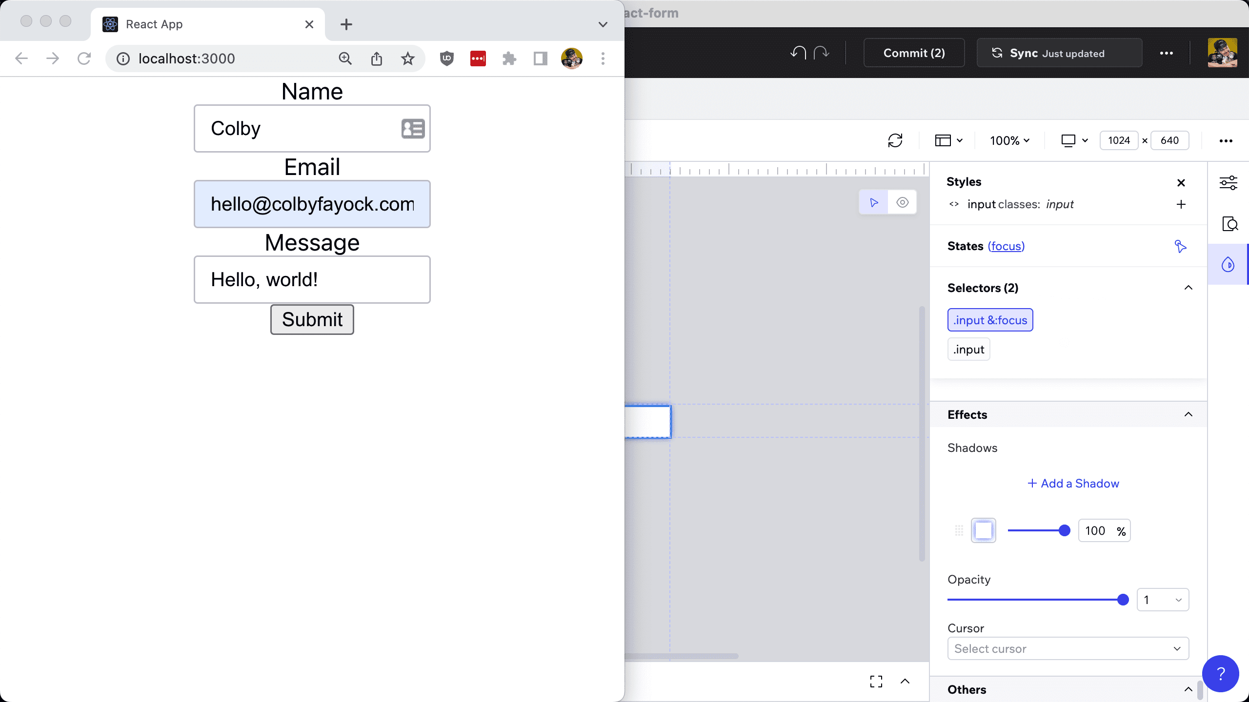
At this point, we can really do whatever we’d like, taking advantage of all the different styling options, customizing the different states for enhanced usability, and making our form look and work great.
A few more things I’m going to do:
- Labels: Create a label selector, align the text to the left, and tweak the font styling
- Form Rows: Create a new FormRow component that wraps the Label and Input inside of App, allowing us to consistently add margin below our elements
- Form: Add padding, semi-fixed sizing, and a shadow around our form element to make it stand out on the page
- Title & Description: Add a title above the form inside App along with a description and a note stating that all fields are required
- Button: Adding a background color, rounding colors, and adding a hover state
Try to see if you can do these on your own with what we learned in the last two steps! I’m intentionally not specifying exactly what I did so you can play with the styles on your own, but you can check out the changes I made by checking out the commit.
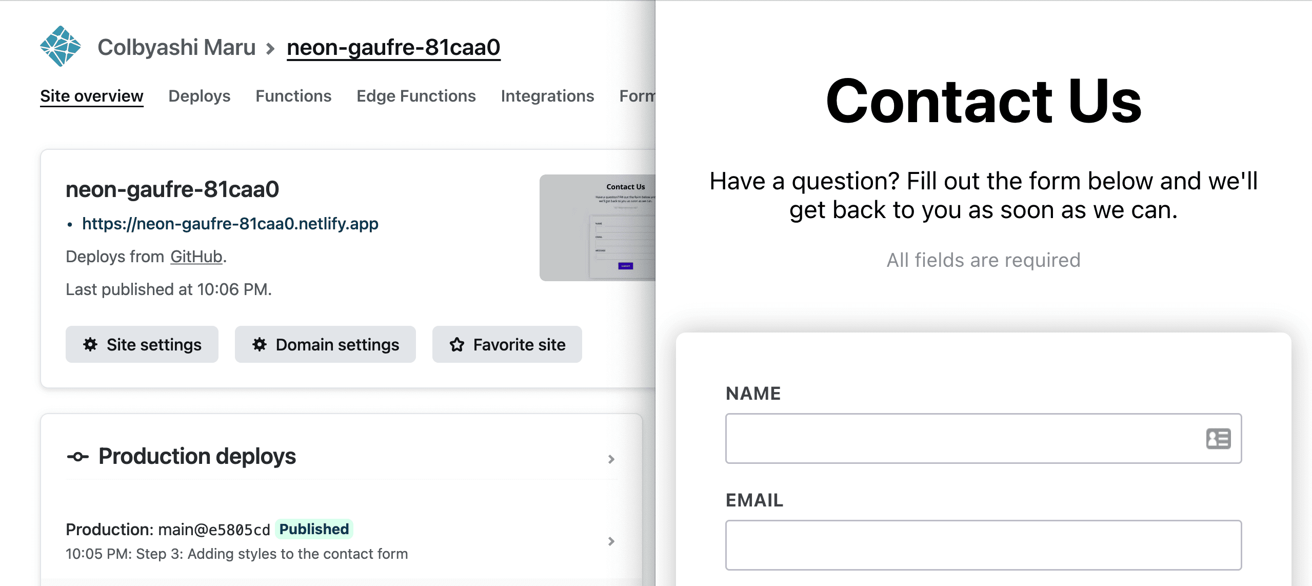
But to show what I put together, here’s the form looking a bit better than where we started!

The best part, as soon as you’re ready, you can commit the changes using Codux like we did earlier and sync the changes. As soon as you do, Netlify will see the new commit pushed up to Github and kick off a new deploy!
Step 4: Using external components with React Icons
When building applications, often we want to use pre-existing components that other have spent a lot of time working onto ensure they’re of the highest quality. This could be libraries like Bootstrap or Blueprint, but it could also be adding icons using libraries like React Icons.
The good news is Codux allows us to load in external modules giving us the ability to then drop them in just like we did with our local components.
To get started with React Icons, we need to first install it using our terminal.
Run:
npm install react-iconsNext, we need to create a configuration file that tells Codux where it can find our components.
For this one, we need to jump into our code editor and manually create this file.
Inside the root of the project, create a new file called codux-external-components.json and add:
[
  {
    "name": "React Icons",
    "components": [
      {
        "filePath": "react-icons/ri",
        "exportName": "RiSendPlaneFill",
        "name": "RiSendPlaneFill"
      }
    ]
  }
]
Here we’re creating a new set of icons under the name React Icons and pulling in an icon that looks like a little paper airplane.
Now back to Codux, first restart the Codux application.
Once you’re back into the project, navigate to the App Component, and click on the Add button under Elements to add a new Component where now we’ll see the React Icons section with our new icon!
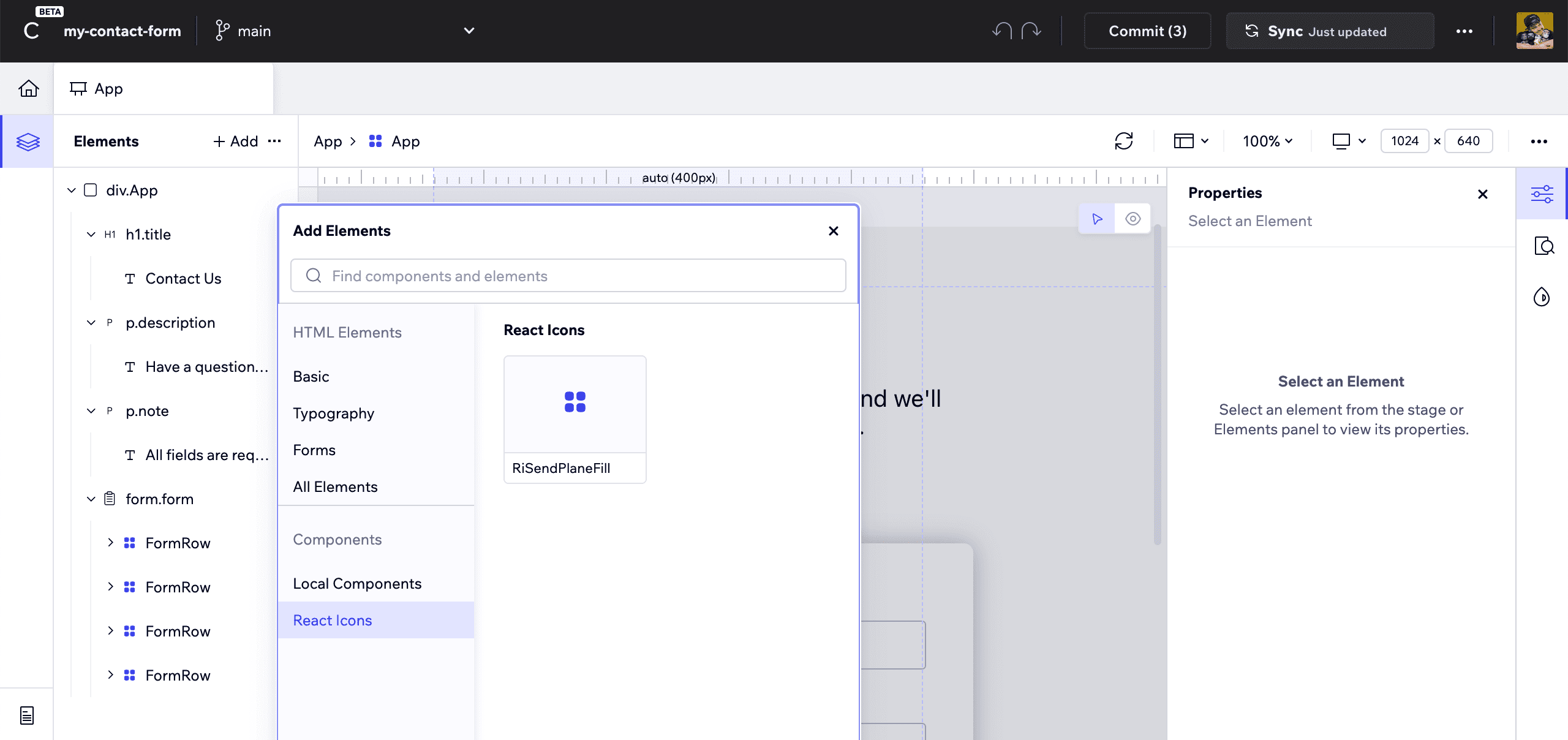
Let’s add this as part of our Submit button, so drop it into the Button Component before the text.
It also seems like it needs a little space, so we can add some right margin to the icon.
But now, we just dropped in an external component right from our Codux editor!

Step 5: Capturing form data in React
Codux has been super handy so far for being able to build out our UI, but now it’s time for the functionality and business logic.
Tip: Technically Codux has a code editor that you can find by navigating to the Files tab in the left sidebar at the bottom (same bar as the Home icon), but you might want to jump to your standard IDE like VS Code depending on your needs and preferences.
Our first step is capturing the data from our form so that we can then POST it to an endpoint.
Inside src/App.tsx, we can place an onSubmit handler on our form element so that any time it’s submitted, we get a triggered function.
First, let’s add our function that will be triggered at the top of the App component:
function onFormSubmit(e: React.SyntheticEvent<HTMLFormElement>) {
  e.preventDefault();
  console.log('e', e);
}
Here we’re running preventDefault on the associated event to prevent the form from submitting to the current page.
Then we can update our form to use this function:
<form className={styles.form} onSubmit={onFormSubmit}>If we try submitting our form in the browser, we’ll see in the developer tools console the event and details along with it.
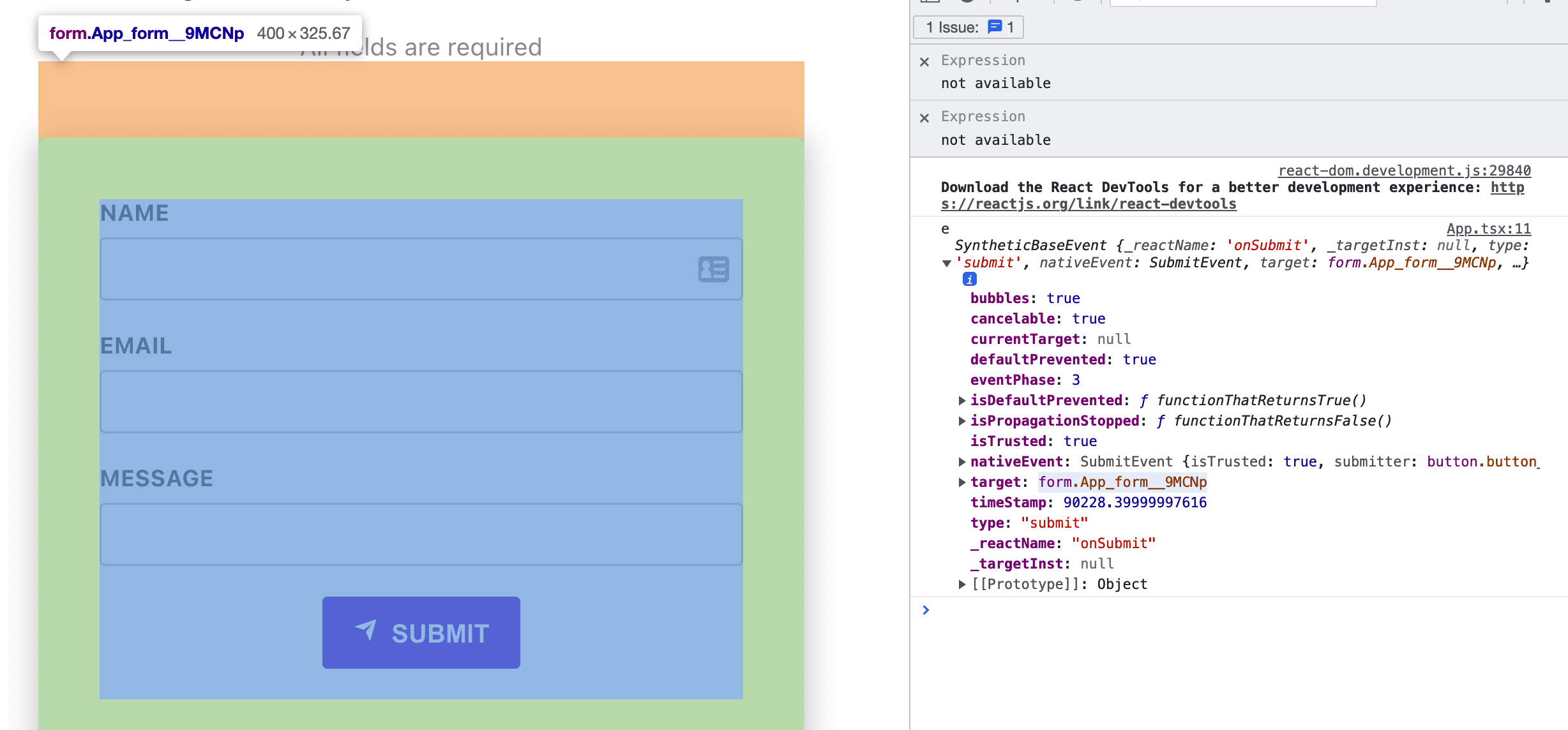
Now our job is to inspect the form along with the fields in the form to grab the values we need.
To do that, we can look to the form elements to grab all the values we need.
Inside onFormSubmit add:
const formData: Record<string, string> = {};

function isInputNamedElement(e: Element): e is HTMLInputElement & { name: string } {
    return 'value' in e && 'name' in e;
}

Array.from(e.currentTarget.elements).filter(isInputNamedElement).forEach((field) => {
    if (!field.name) return;
    formData[field.name] = field.value;
});

console.log('formData', formData);
Here we’re:
- Initializing a form data object to store our fields
- Creating a Typescript-specific filter to help us parse the correct elements
- Creating an array from our elements, which is needed as by default elements is a collection, not an array
- For each of our valid elements, we grab the name and the value to fill out our form data
While we could manually grab each of the values, this is a nice way to grab all the fields, having flexibility that if we add a field, we can automatically get the value..
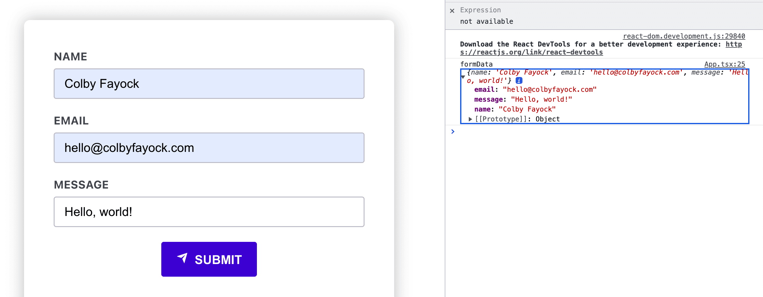
But again, if we submit our form with information filled out, we can see it all in an object!
Step 6: Creating a Netlify Function to POST form data
There are a lot of services we can use to send contact form details to, but not all of them have secure client-side APIs, where a lot of the time you need to provide an API key and API secret, which you can’t do securely from a browser alone.
To mitigate this, we can use a serverless function to create a secure proxy using our service’s SDK.
In particular, we’ll use Netlify Functions, which is easy to add using our existing Netlify deployment.
As far as creating the function and deploying it, we can add a few files and be done with it, but we want to test this locally, so we’ll use Netlify’s CLI which will allow us to both run a development server for our React project as well as a server for our functions which will process our form request.
In your terminal, run:
npm install netlify-cli -gOnce installed, we need to log in to the CLI with:
netlify loginThis will open a browser tab with netlify.com that will allow you to authorize a new session for your CLI.
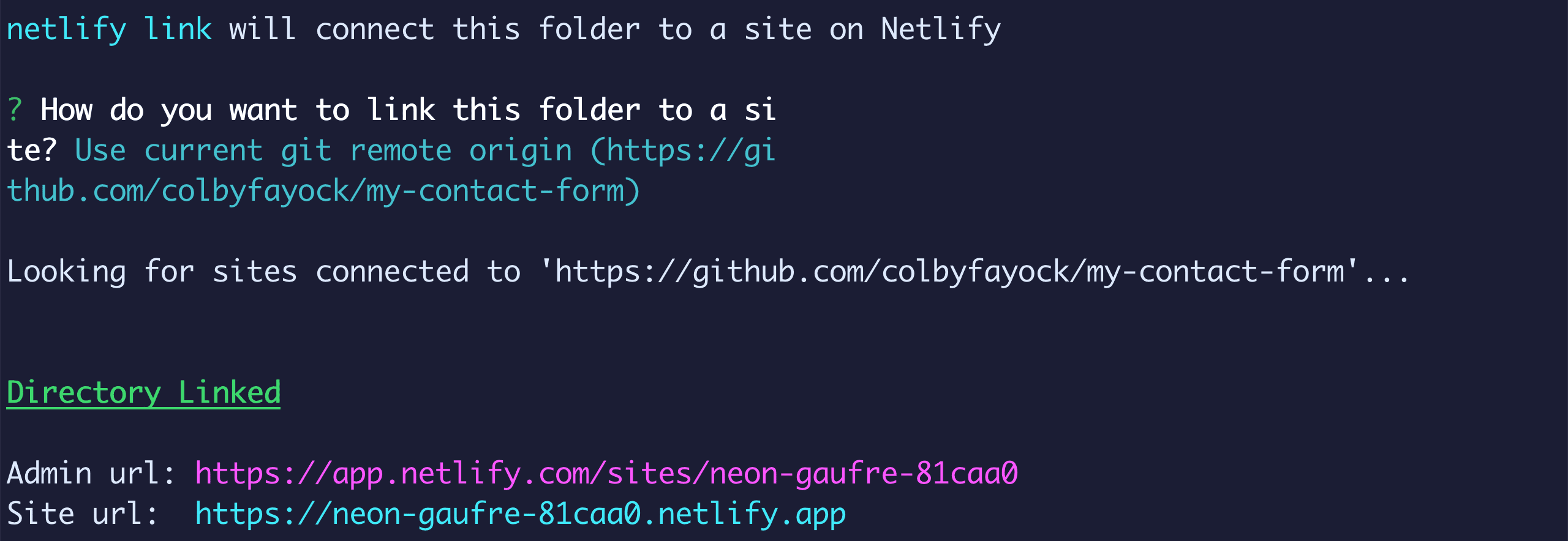
And before we can start using, we need to link our project.
netlify linkHere we want to connect our local project to the Netlify project we deployed earlier, so we can use one of the options listed, but the easiest is to “Use current git remote origin” which will automatically set everything up.
Now we can start coding!
First, we can spin up our servers by running:
netlify devAt this point, we only have the React app, so that’s all we’ll see, but Netlify uses a different port, so we’ll see it open at http://localhost:8888 by default.
But once it does, we should see the same React app we did before, so now let’s add our functions.
To create our function, we first want to tell Netlify where we’ll create them.
In the root of the project create a file called netlify.toml and inside add:
[functions]
  directory = "functions"
Now we can create our function itself.
Create a folder called functions and inside create a file called mail.tsx.
Inside functions/mail.tsx add:
exports.handler = async function (event, context) {
  return {
    statusCode: 200,
    body: JSON.stringify({ message: 'Success!' }),
  };
};
Here we’re setting up our handler function and at this point just returning a successful status with a success message in the body.
To test this out, we need to first restart our development server, otherwise it won’t work.
But now, if we head to our browser at the following location, we should see our function:
http://localhost:8888/.netlify/functions/mail
Tip: Using file-based routing, you can find your basic Netlify functions at
<host>/.netlify/functions/<filename>

We’re able to test this out because at this point, we’re not doing anything in that request that requires POSTed data, but next we’ll parse the body of the incoming request, which will require us to make requests in the app or a specialized method to send requests.
First, let’s parse the body by adding the following to the top of our handler inside functions/mail.tsx:
const body = JSON.parse(event.body);
console.log('body', body);
Then back in our app, let’s send our form data.
Inside onFormSubmit after we collect the form data, add:
fetch('/.netlify/functions/mail', {
  method: 'POST',
  body: JSON.stringify(formData)
}).then(response => {
  // Do something here on success!
}).catch(error => {
  // Do something here on error!
});
Here we’re using the fetch method to send a request to our mail endpoint with our form data. I also tagged on a then and catch statement for success and error handling.
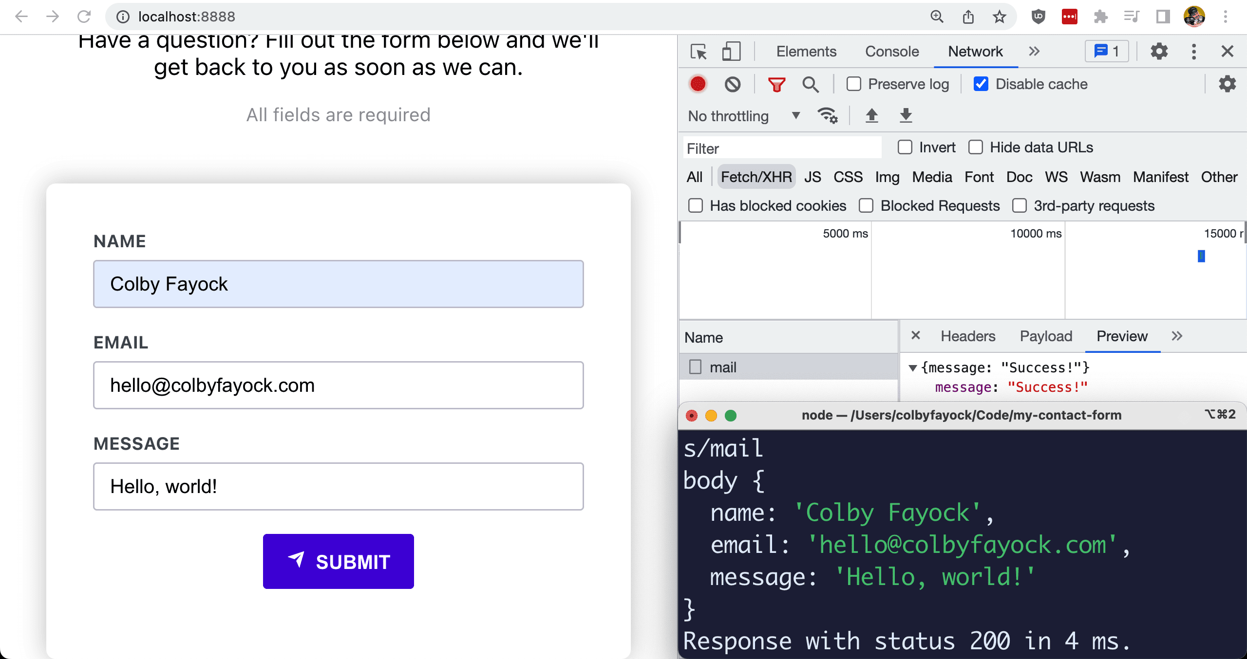
If we try to submit our form, we’ll see the network request made to our mail endpoint, but we’ll also see in our terminal the logged body that we sent from our form!
But now, we have our form data and we’re sending it to a serverless function, so all that’s left now is to use it to send an email with the information, which we’ll do next!
Step 7: Email contact form details with SendGrid
When building a contact form, we ultimately want to send the information somewhere. Email is a common way to get the information to someone so to do that we’ll use SendGrid.
Now just a heads up, given this is a single part of a bigger tutorial, we won’t cover the full end-to-end setup of SendGrid, rather, we’ll focus on setting up the SDK as an example of how to build a full solution. If you want to learn how to walk through the entire SendGrid setup, check out my tutorial How to Send Emails with SendGrid and Next.js Serverless Functions for a Contact Form, which uses Next.js for the function, but the same concepts apply and covers the rest of SendGrid.
Starting off, we’ll use the SendGrid Node mail SDK, which you can install with:
npm install @sendgrid/mailTo connect SendGrid to our account, we’ll need to set up our API key.
Create a new file in the root of your project called .env.local and add:
SENDGRID_API_KEY="<Your API Key>"Note: we should already have
.env.localadded to our.gitignorefile but I would recommend that you check that you do before moving forward to avoid accidentally committing your API key.
In order for your API key to allow you to send mail, you’ll need to at least have Mail Send access configured.
But now, let’s set up our SDK.
At the top of functions/mail.tsx add:
const mail = require('@sendgrid/mail');

mail.setApiKey(process.env.SENDGRID_API_KEY);
Then inside of the function under the body parsing, add:
const message = `
  Name: ${body.name}rn
  Email: ${body.email}rn
  Message: ${body.message}
`;

await mail.send({
  to: '<Your Email Address To Send To>',
  from: '<Your SendGrid Configured Email>',
  subject: `New Message from ${body.name}!`,
  text: message,
  html: message.replace(/rn/g, '<br>'),
});
Tip: Put your TO and FROM email addresses in an environment variable to avoid them being committed to code and easily changeable per environment.
Here we’re:
- Creating a new message string that includes our field values
- Each line has
rnto allow us to create new lines inside the email - Once that’s set up, we use
mail.sendto send our request - That includes the email addresses we’ll use, a subject, and both a text and HTML version of our email
Note: you could also create a full HTML email representation, but that’s out of scope, and generally I recommend always sending a text email as well for people who don’t accept HTML emails.
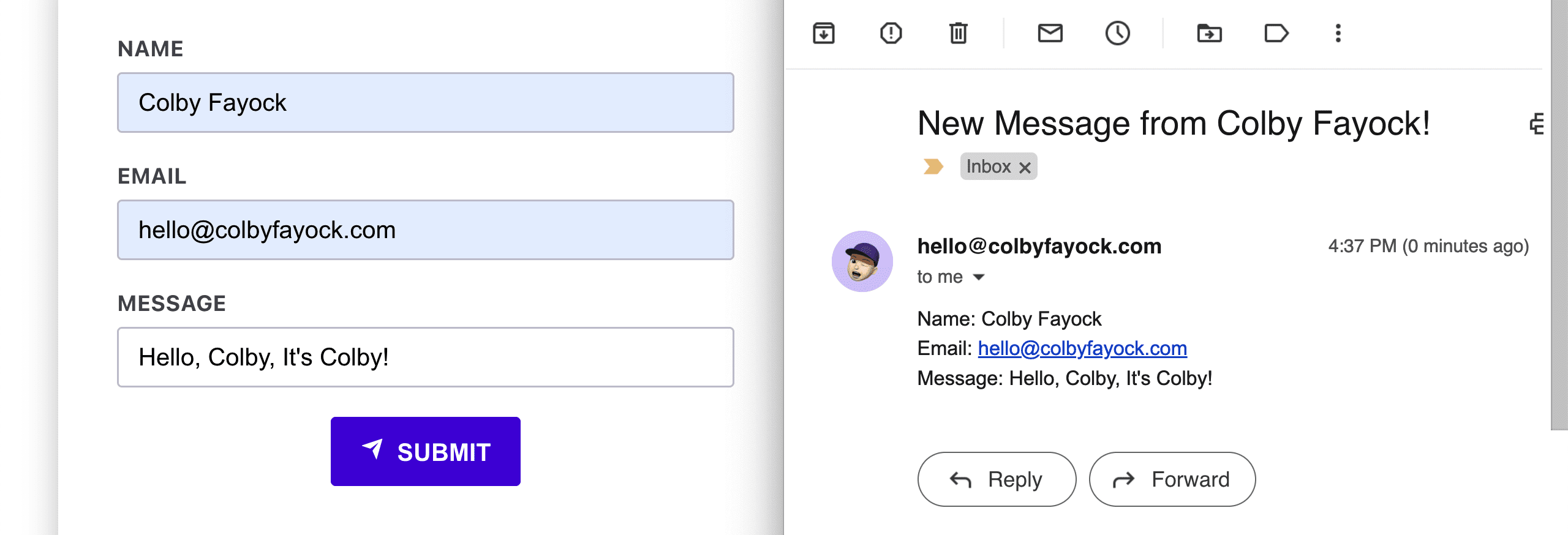
But now if you try submitting your form again, as long as SendGrid is set up properly, you should now see an email drop in to your provided email!
What else can we do?
Loading and successful send states
To help improve the UX a bit, we can create a visual state for when the mail is sending as well as when its successfully sent.
Try locking the form when the submit form is triggered and hiding the form once successfully sent. Bonus points for handling errors!
Work with responsive sizes and styling
As part of the UI, Codux if you the ability to change the window and preview size, allowing you to see how your project looks responsively.
Play with the different sizes and see how your app flows, being able to design for multiple devices is important for building a great experience for the web.
More customizations with props
We scratched the surface for utilizing props in our app, what about being able to change the color of our button on-the-fly?
Configure your components so they’re fully customizable as a start for your new component design system.

