

Thanks @domitriusclark for answering a few of my questions to make this work!
What is Next.js Image?
next/image is a first class component supported in Next.js. It unlocks some easy to use image management features like image optimization and responsive sizing.
At the core of it, it’s meant to be a somewhat “drop-in” replacement for images, where you can pass in an image source, width, height, and automatically get lots of benefits.
Note: One caveat, Next.js wraps the image with div (
<div>)tags making it invalid to nest in paragraph (<p>) tags.
next/image ships right with Next.js itself, making the barrier to entry low for developers, but there are other image management tools like Cloudinary, that when coupled with Next.js, provides some powerful options.
What is Cloudinary?
Cloudinary is a media management solution that not just allows teams to manage, optimize, and transform images, but video as well.
There are a ton of cool things you can do with Cloudinary, such as automatically generating social media images or at it’s simplest, using Cloudinary as a CDN. It also makes for a great way to smooth out a project workflow for designers and developers to manage and use images.
The catch though, is you have to do all of this programmatically or manually, meaning, if we want some of the features like responsive images, we would need to generate each of those images and apply them in our code.
Why do we want to use Cloudinary with Next.js Image?
While separately, the next/image component and Cloudinary both offer a range of powerful features, bringing them together can unlock some great ways to creatively developer experiences for the people visiting your site.
With Cloudinary, we can provide any sort of transformation we want programmatically to our image. This includes dynamic cropping, color effects, blur effects (like we’ll see below), and dynamically creating image patterns.
With Next.js, we can get responsive image sizes in an easy to use API, where we plug in any image, and we get a more performant app “out-of-the-box”.
As one example, we can use Cloudinary to generate our dynamic images, then pass it into our Next Image component to make it responsive.
Note: Cloudinary alone does a lot of great optimizations, but you would typically have to set up things like responsive images a bit more manually.
We can also do things like create blurred image placeholders, where cloudinary can automatically generate a blurred version of our image, where we use the real image on top with Next.js. Little things like this provide a better experience for people visiting our projects.
What are we going to build?
To show how this works, we’re going to start off with a basic Next.js app that we’ll start from scratch. If you already have a Next.js app you’d like to use, feel free to skip Step 0.
From there, we’ll learn how to use the Next.js Image component with local files, use a Cloudinary image with the Image component, and how to create a simple blurred image placeholder feature for our image.
Note: you’ll need a free Cloudinary account to get started!
Step 0: Creating a new Next.js app
Starting off, we’ll need a Next.js app. To do this, we’ll use Create Next App which will scaffold a brand new project for us.
In your terminal, run:
yarn create next-app my-next-cloudinary
# or
npx create-next-app my-next-cloudinary
Note: feel free to change
my-nextjs-appto whatever name you’d like for the project.
Once that finishes running, you can navigate into that directory and start your development server:
cd my-next-cloudinary
yarn dev # or npm run dev
And once loaded, you should now be able to open up your new app at http://localhost:3000!
Note: I updated the title of the page and removed the description, feel free to do the same!
Step 1: Adding a new local image with Next.js Image
For our first step, we’ll learn how to use the Next.js Image component with a local image.
In order to do that, we’ll need an image to work with.
I like all things space, so I’m going to use a picture of a galaxy from nasa.gov, but feel free to use whatever you’d like!
When you have your image, add it to the public directory inside of your project.
Now, to use the Next.js Image component, we want to import it into our project.
At the top of pages/index.js add the following:
import Image from 'next/image'This will make the Image component available for us to use on our homepage.
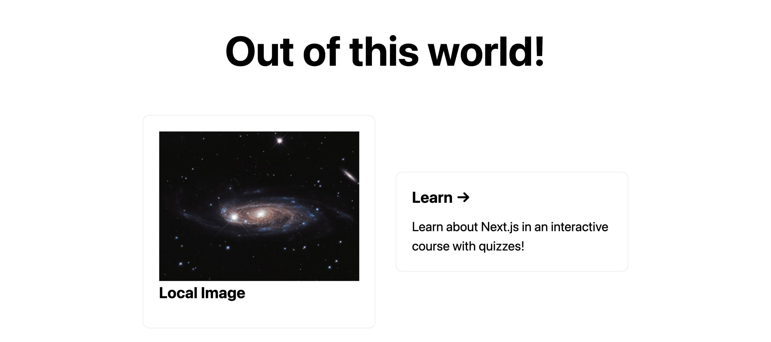
Next, we can replace the first grid item inside of <div className={styles.grid}> with our image.
<div className={styles.card}>
  <Image
    src="/galaxy.jpg"
    alt="Galaxy"
    width={1000}
    height={750}
  />
  <h3>Local Image</h3>
</div>
Here, we’re:
- Changing the first grid card from an anchor tag (
<a>) to a div (<div>) since we’re not making a link - We’re updating the header tag to a new title “Local Image”
- We’re adding the Image component referencing our local image in the
publicfolder (this filename should match your image filename in your project) - We’re setting an
altprop just like a normal image tag - We’re setting a width and height
Note: Next.js needs the width and height to work property as it needs to maintain the ratio of the image. Even with the width and height, the image will still be responsive!
And now, if we check out our page in the browser, we can see our new image!
Step 2: Using static Cloudinary image URLs with Next.js Image
One of the features of the Next.js Image component is that it allows you to create custom “loaders”, meaning, it allows you to pass in different image sources which Next.js can learn to understand, and pull into the optimization process.
To handle pulling in images from a CDN, like Cloudinary, we can configure our Next.js application to recognize that URL and build our image.
First, we’ll need to create a new file in the root of our project called next.config.js. Inside of that file, add the following:
module.exports = {
  images: {
      domains: [
        'res.cloudinary.com'
      ],
  },
}
Here, we’re:
- Defining a new configuration object for Next.js
- Inside, were defining a custom configuration for
images - For our images, we’re telling it we want it to recognize our domain of
res.cloudinary.com, which is Cloudinary’s default domain for images
Note: you’ll need to restart your development server for this change to kick in!
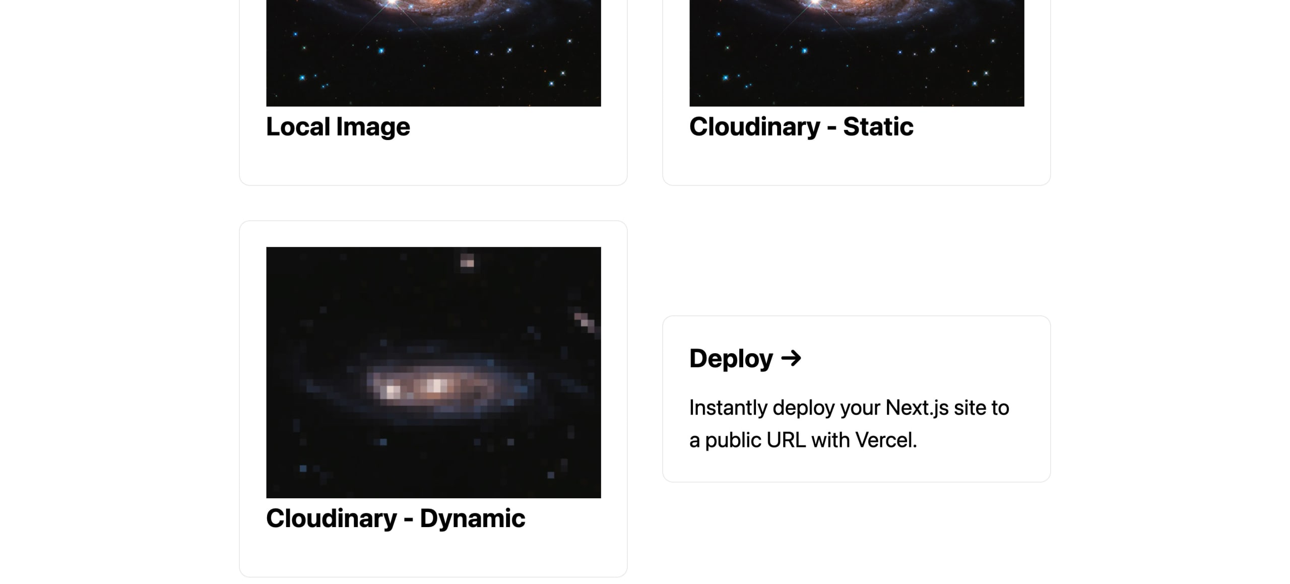
Now, with that simple configuration, we can add our Cloudinary image back inside of pages/index.js, we can replace the 2nd card link like we did in the last step with:
<div className={styles.card}>
  <Image
    src="https://res.cloudinary.com/fay/image/upload/v1617047570/galaxy_ne5p8f.jpg"
    alt="Galaxy"
    width={1000}
    height={750}
  />
  <h3>Cloudinary - Static</h3>
</div>
Here, we’re:
- Creating a new card, replacing an existing one in our project
- Adding a new Image component
- Using a Cloudinary URL as the image source
- Updating the header
Note: feel free to use my image there as an example, or if you’re following along with your own Cloudinary account, swap your own in!
Now if we load up our page, we can see that our new image looks exactly like our other image (if we’re using the same one uploaded to Cloudinary)!

The difference, because we’re using Cloudinary, we now have the ability to take advantage of Cloudinary features like transformations right in our project!
Step 3: Using Cloudinary’s URL builder for dynamically generated images
To take full advantage of the Cloudinary API, we can use an npm package that takes in a configuration dynamically, allowing us to leverage Cloudinary’s image API to it’s fullest extent.
First, let’s install the Cloudinary URL Builder package:
yarn add cloudinary-build-url
# or
npm i cloudinary-build-url
Next, let’s dynamically create a URL to add a new image to our project. Inside of pages/index.js at the top of the file, let’s first import the dependency:
import { buildUrl } from 'cloudinary-build-url';Now, at the top of the Home component, add:
const url = buildUrl('[Your Cloudinary Image ID]', {
    cloud: {
      cloudName: '[Your Cloudinary Cloud Name]',
    },
    transformations: {
      effect: {
        name: 'pixelate',
        value: 40
      }
    }
});
Here, we’re:
- Using the
buildUrlfunction - We pass in our Cloudinary Image ID as the first argument
- As a second argument, we pass in a new configuration object
- Here, we define our Cloudinary Cloud Name
- We also apply transformations, particularly here, we’re pixelating our image
Note: for this step, you’ll need to have your own Cloudinary account, where you’ll be able to find your Cloud ID as well as uploading an image, where after, you’ll be able to find your Image ID.
This will construct a Cloudinary image URL just like we used in Step 2.
So now, let’s use this in our app.
Similar to the last two steps, replace the 3rd card link with:
<div className={styles.card}>
  <Image
    src={url}
    alt="Galaxy"
    width={1000}
    height={750}
  />
  <h3>Cloudinary - Dynamic</h3>
</div>
Here, we’re:
- Creating our new card and image just like the last two steps
- But this time, we’re using the
urlas the source that we defined above
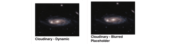
Now, if we load the page, we can see that Cloudinary will construct our image, and it will load in our app, all pixelated!
Step 4: Using Cloudinary to create a blurred loading effect
For our last example, we’re going to combine all of our steps to create a “loading” effect, where we’ll use a blurry image generated by Cloudinary that will show in our application until the full image loads.
Note: this might be hard to see with fast internet connections, so we’ll do a workaround to see it work in practice!
To get started, let’s first construct a new image URL using the buildUrl function. At the top of the Home component, below the url, add:
const urlBlurred = buildUrl('[Your Cloudinary Image ID]', {
  cloud: {
    cloudName: '[Your Cloudinary Cloud Name]',
  },
  transformations: {
    effect: "blur:1000",
    quality: 1
  }
});
Here, we’re:
- Dynamically generating our image just like before
- This time, we’re doing a different transformation, where we’re blurring our image
- We’re also setting the quality to 1 to help reduce the file size, making it a great placeholder image
Now to use that image, let’s add it to a new Image:
<div className={styles.card}>
  <Image
    src={urlBlurred}
    alt="Galaxy"
    width={1000}
    height={750}
  />
  <h3>Cloudinary - Blurred Placeholder</h3>
</div>
And once we load up our page, we can see that something’s actually wrong!

Our blurred image isn’t blurred, it’s instead pixelated and distorted, not how it should be!
Now, we’re not going to actually use this particular URL for our placeholder, but this is a possible gotcha in this scenario.
What’s happening, is Next.js is trying to optimize our blurred image after it’s blurred. It ends up being terribly distorted.
To fix this, we can pass in a prop to our Image component to tell Next.js to avoid optimizing it:
<Image
  src={urlBlurred}
  alt="Galaxy"
  width={1000}
  height={750}
  unoptimized={true}
/>
Now, if we load up our page, we can see it works perfectly!

Next, we want to actually make this image a placeholder image, so that we show a nice experience before our real image loads.
Let’s replace our full card block with:
<div className={styles.card}>
  <div style={{
    position: 'relative',
    height: 0,
    paddingTop: `${( 750 / 1000 ) * 100}%`,
    backgroundImage: `url(${urlBlurred})`,
    backgroundPosition: 'center center',
    backgroundSize: `100%`
  }}>
    <div style={{
      position: 'absolute',
      top: 0,
      left: 0
    }}>
      <Image
        src={url}
        alt="Galaxy"
        width={1000}
        height={750}
        unoptimized={true}
      />
    </div>
  </div>
  <h3>Cloudinary - Blurred Placeholder</h3>
</div>
This one is a big snippet, so let’s break it down:
- We’re first adding a new div (
<div>) wrapper around our image - On that wrapping div, we’re setting a few style attributes
- We’re giving it a height of zero and a padding top which is the ratio percentage of the width and height. This is a trick to fill the space of a div with a ratio responsively
- We’re then adding the background image of the blurred image URL
- Next, we’re adding another wrapping div around our image
- This time, we’re seeing the positioning the that absolutely to the top left corner of our parent
What ends up happening, is we’re filling an empty space before our image loads with our div and a background image.
If we reload the page, we might be able to see that before our real image loads, a blurry version loads in the background. It even works responsively!

It might be too quick to see though. Even hard refreshing (in Chrome on Mac, CMD+Shift+R), it still might be too fast if you’re on a fast internet connection.
At this point of the tutorial, we’re actually done! But if you want to see what this actually looks like, we can do a quick hack to artificially delay loading our image.
We’re going to use React’s useState and useEffect to do this. First, let’s import those in:
import { useEffect, useState } from 'react';Next, add this snippet at the top of your Home component:
const [image, setImage] = useState();

useEffect(() => {
  setTimeout(() => {
    setImage(url);
  }, 2000)
}, [])
Where we’re doing is:
- Creating a new state instance, which will be our image URL
- We’re not setting a default state URL, as we’ll check to see if it exists in order to render our real image
- We’re using a
useEffecthook along withsetTimeout, so that after 2 seconds (2000 milliseconds) pass, it will update our state to be our original url
Finally, we just need to now use that image variable for our component:
<div style={{
  position: 'absolute',
  top: 0,
  left: 0
}}>
  {image && (
    <Image
      src={image}
      alt="Galaxy"
      width={1000}
      height={750}
      unoptimized={true}
    />
  )}
</div>
Here, we’re:
- Checking if the
imageexists (it won’t by default) - Once it does exist, it will add our Image component using that as a URL
- We removed
unoptimized={true}as we want this real image to be optimized
Note: we can safely not include the image component and still maintain the size because we’re using the padding trick to set the height as we talked about earlier.
Now, if we load this in our browser, it should by default load a blurred image, but then once it’s loaded after 2 seconds, we should see our real, pixelated version!
What else can we do?
Cloudinary has a ton of transformations available as part of it’s API. Whether using it to provide a blurry placeholder image or automating social media images, take some time to explore what’s available and come up with your own creative use cases for the too!