

Getting Text Selections in React with the Selection API
The Selection API is a browser-native API that allows us to listen for changes to a selection in the browser to read and interact with them.
Primarily in our case, we’re interested in listening for the selection to change and when it does, grab the currently selected text. But what about React?
Similarly to other browser APIs like the previously covered Copy to Clipboard, we can utilize event listeners that only run when our client application mounts, allowing us to them tap into our selection information.
Step 01: Listening for Selected Text with selectionchange
The first step is to listen for when the selected text has changed, indicating that we may or may not have an active text selection to read.
First we need to import useEffect from React:
import { useEffect } from 'react';We’ll then use the useEffect hook to add an event listener for the selectionchange event and with it, a callback function that will fire upon selection:
useEffect(() => {
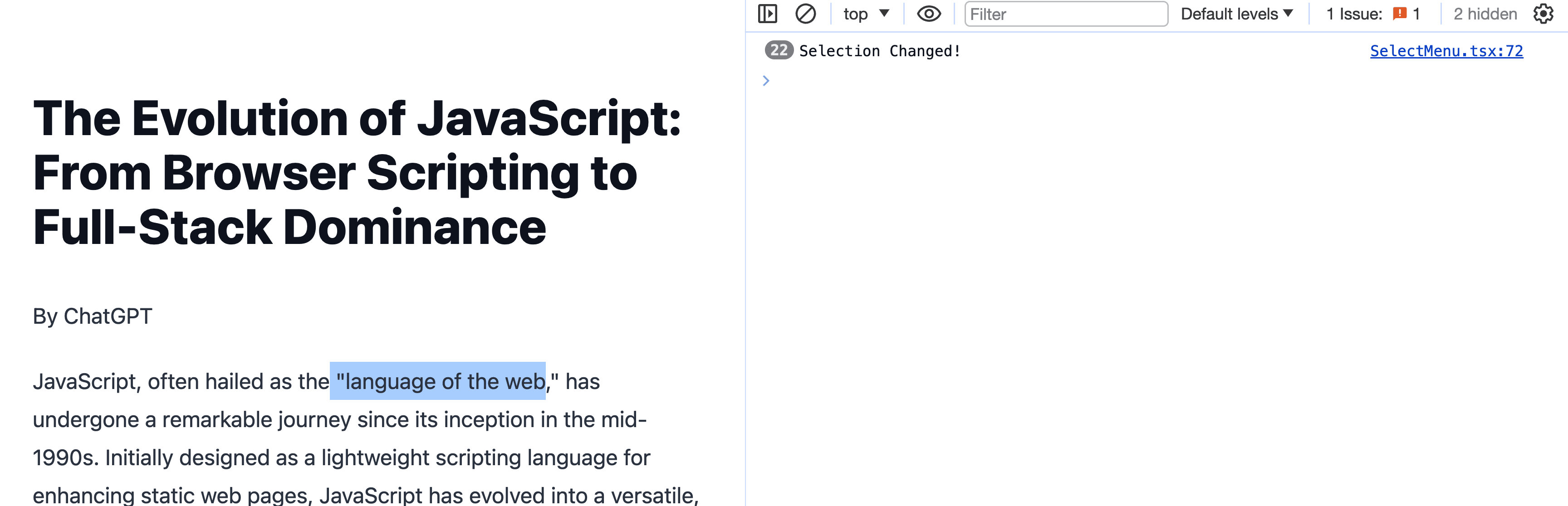
document.addEventListener('selectionchange', () => {
console.log('Selection Changed!')
});
}, [])And if we go to our browser and select some text, we should see our console log fire.
But this doesn’t do much good unless we can read that selected text.
Step 02: Reading Selected Text with getSelection
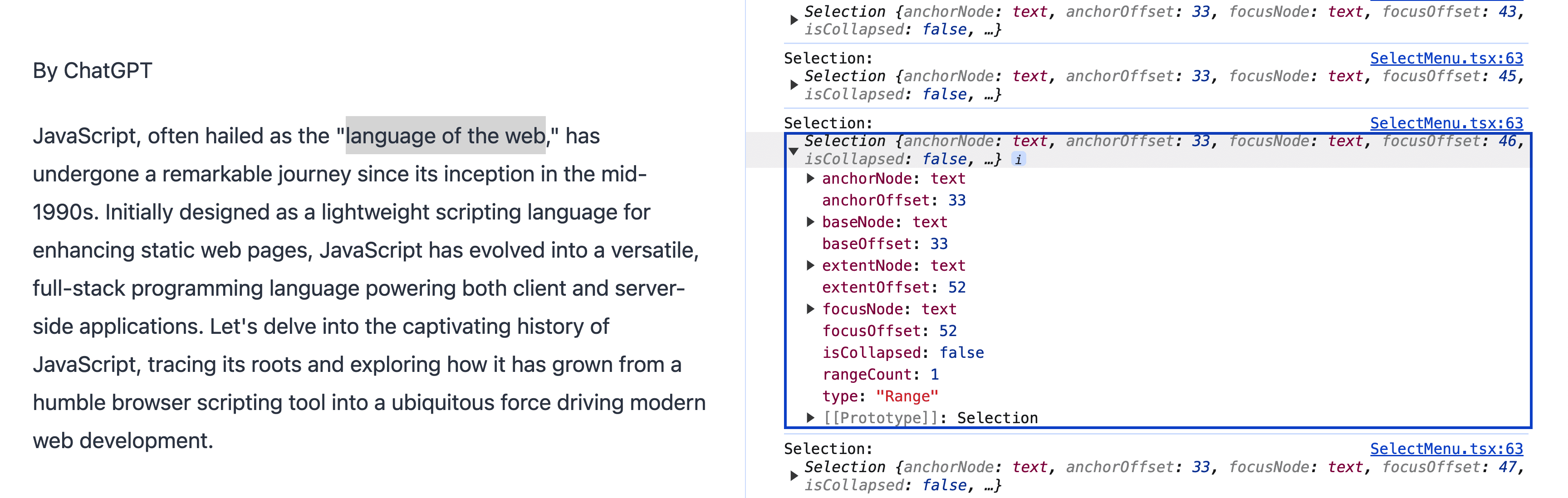
Once we’re listening for the change, we can now use the getSelection method in order to try to get that text.
useEffect(() => {
  document.addEventListener('selectionchange', () => {
    console.log('Selection:', document.getSelection())
  });
}, [])
If we load up our browser and try to select some text, we’ll see a Selection object in the web console.
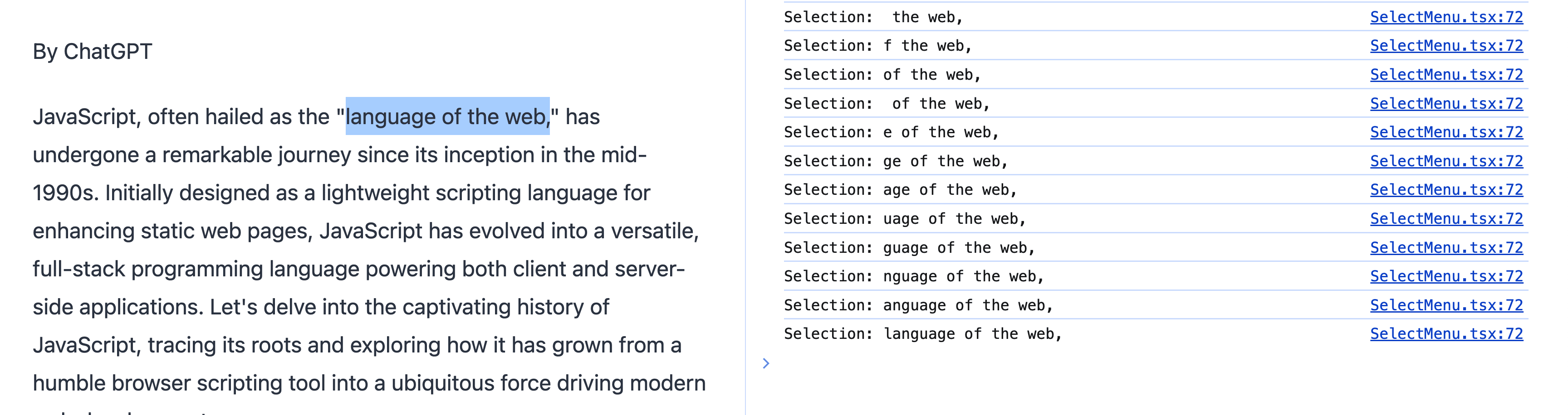
This has some helpful information, but not quite what we need, so we can use the toString method on the Selection object to grab our text:
useEffect(() => {
  document.addEventListener('selectionchange', () => {
    console.log('Selection:', document.getSelection()?.toString())
  });
}, [])
And now when we try to run this, we should see our text!
Step 03: Storing Selected Text with useState
In order to do anything with our text, we need a way to store it, where we can interface back into React’s useState.
First we need to import useState:
import { useEffect, useState } from 'react';Then we can set up a new instance of state in order to store our value:
const [selection, setSelection] = useState<string>();And finally, whenever our event handler for selectionchange fires, we can store that value:
useEffect(() => {
  document.addEventListener('selectionchange', () => {
    setSelection(document?.getSelection()?.toString());
  });
}, [])
Finally, in order to see the results and make sure it’s working, we can render the text to the page:
<p>Selection: { selection }</p>Once we hit our browser and select some text, this time, we can see the text.
Step 04: Adding a Share Widget & Sharing Selected Text
Now that we have our selected text ready to go, how do we share it?
First let’s add a UI that allows us to have a share button in the first place.
As part of the UI, I like to show an icon to indicate it’s being shared on a particular platform. To do this, I’ll use Lucide React and import their Twitter icon.
First, install lucide-react with:
npm install lucide-reactThen we can import the Twitter component:
import { Twitter } from 'lucide-react';Finally, we can drop in our UI including our icon:
<div role="dialog" aria-labelledby="share" aria-haspopup="dialog">
  {selection && (
    <p>
      <button>
        <span id="share">Share</span>
        <Twitter />
      </button>
    </p>
  )}
</div>
Tip: If you want some Tailwind styles, check out the commit!
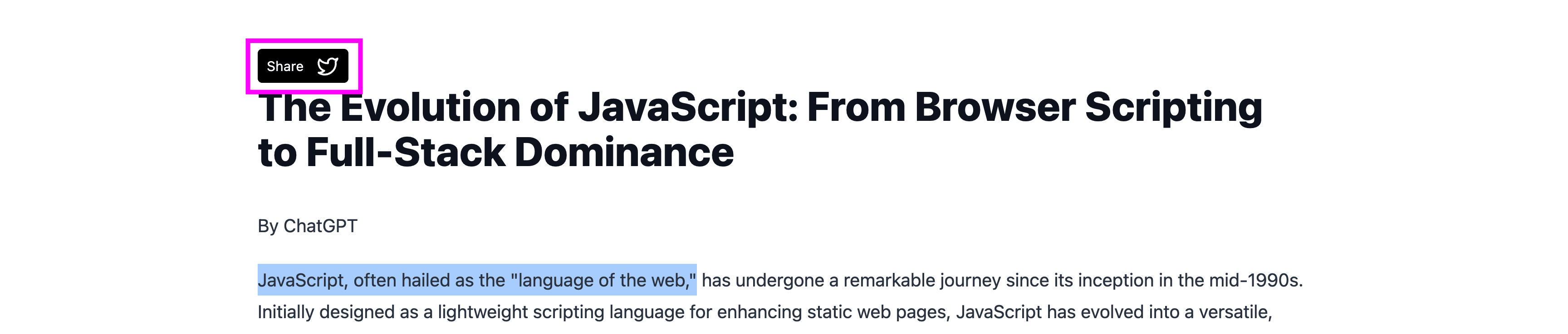
If you notice, we have some attributes on our surrounding div to help with accessibility, but we also only show the button itself if the selection exists, as we don’t want to show this at all times, we only pop it up when there’s something to share.
If we head to the browser and select some text, we should see our button, but we notice that it doesn’t do anything.
Next, when someone clicks this button, we want to actually share something.
First, let’s define a function that we can use as our event handler:
function onShare(text?: string) {
  if ( !selection ) return;
  const message = [
    `"${encodeURIComponent((text || selection).substring(0, 120))}"`,
    encodeURIComponent(window.location.href)
  ].join('%0A%0A')
  const url = `https://twitter.com/intent/tweet?text=${message}`
  window.open(url, 'share-twitter', 'width=550, height=550');
}
There’s a lot going on in this one, where first off, if we don’t have any selection, let’s bail. But if we do have a selection, we’re going to use the Twitter Web Intent API which allows us to compose a new Tweet via URL.
So we first construct a message that includes the selected text and current URL encoded as a URI component. We also join those segments together with encoded returns to add some spacing. We then use that message to create our Web Intent URL, which we use window.open to pop it up into a new window.
To trigger this function, we can simply add a click handler on our button:
<button onClick={() => onShare()}>If we now head back to the browser and select some text again, then click our button, we should see our Tweet pop up with some text and a URL!
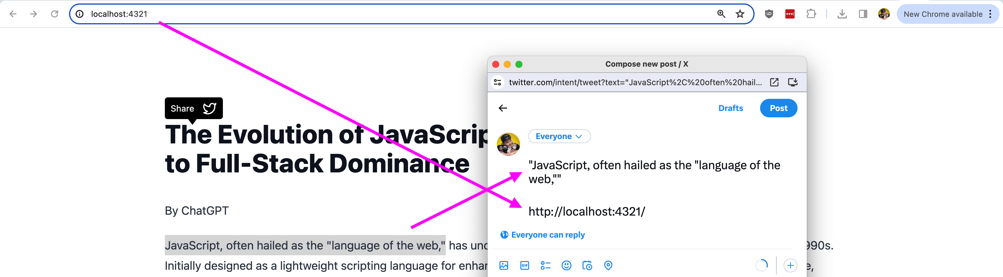
Note: when running this locally, we’ll notice that we share a localhost URL, which won’t work when shared, but when in production, the URL of your website will be used!
Step 05: Dynamically Positioning Share Widget Based on Selection
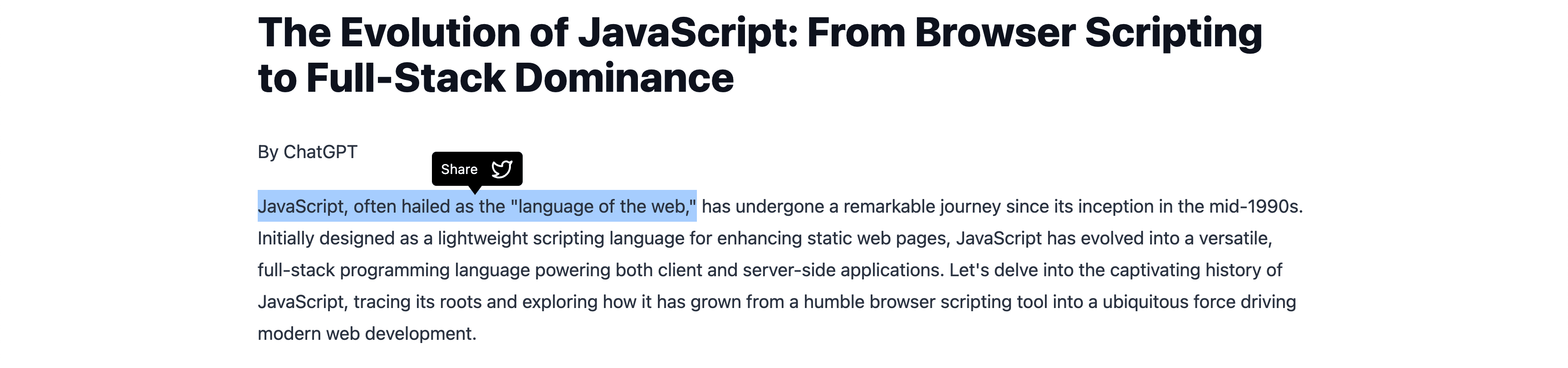
Our share button looks great, but it’s not in the right place! We want it to pop up over our text so it’s contextual to what our visitor is selecting.
When using the Selection API, we also gain information about what node the selection is included in, so we can use that along with some positioning to get our component to the right spot.
To start, let’s create a new instance of state to store our position that we’ll use on the component:
const [position, setPosition] = useState<Record<string, number>>();Next, we’ll need to update our selectionchange event handler so thatwe can grab the position of our active selection:
useEffect(() => {
  document.addEventListener('selectionchange', () => {
    const activeSelection = document.getSelection();
    const text = activeSelection?.toString();

    if ( !activeSelection || !text ) {
      setSelection(undefined);
      return;
    };

    setSelection(text);

    const rect = activeSelection.getRangeAt(0).getBoundingClientRect()

    setPosition({
      // 80 represents the width of the share button, this may differ for you
      x: rect.left + (rect.width / 2) - (80 / 2),
      // 30 represents the height of the share button, this may differ for you
      y: rect.top + window.scrollY - 30,
      width: rect.width,
      height: rect.height,
    })
  });
}, []);
Let’s walk through this:
- We break up how we’re storing the
activeSelectionandtextso that we can reference both later, but also so that we can determine if they exist in the first place, and clear the current state if not - Once we determine they exist, we set our text selection like we did before into state
- Next we use our
activeSelectionto use thegetRangeAtmethod, which allows us to get the “Range” of the selection, which is essentially the nodes and text included in those nodes - We then use the
getBoundingClientRectmethod on that Range which allows us to grab the position and dimensions - The result of
getBoundingClientRectis an object that includes methods that we don’t want to store into state, so instead, we create our own new object that includes the positioning we need to put our element in the right spot - That positioning not only utilizes the relative positioning of the selection, but we also use the current scroll position as well as the size of our share button so that we can position it perfectly in the middle
Note: You may need to update the size values in the snippet above as well as ensure that your UI has absolute positioning applied to correctly position it in your document. You can check out the example to see the Tailwind styles I’m using to achieve this!
Now we have one more thing, we need to apply the positioning to our button.
We’ll use the style prop on our paragraph tag which wraps our button to dynamically pop it into place:
<p
  style={{
    transform: `translate3d(${position.x}px, ${position.y}px, 0)`
  }}
>
  <button onClick={() => onShare()}>
We use the translate3d transformation which takes an x, y, and z (we don’t use Z so just 0) to position it to the right spot.
But now if we open this up in our browser and select some text, we can see it’s beautifully positioned over our text!
Step 06: Using selectstart and mouseup events to Detect Selection Finished
Our tooltip is looking great, but there’s one issue in that it’s constantly moving whenever a selection is actively being made.
It’s not the worst thing in the world, but it looks jumpy all over the page, where perhaps a better UX would be to only show it after a selection is finished being made.
This is a bit tricky, as we don’t get a selection end event, only a change and a start event, but we can use the mouseup as a way to determine if in that interaction, they selected something.
So we’re going to start off by moving our existing event handler logic to the mouseup event and in doing so, optimizing the code a bit.
function onSelectEnd() {
  const activeSelection = document.getSelection();
  const text = activeSelection?.toString();

  if ( !activeSelection || !text ) {
    setSelection(undefined);
    return;
  };

  setSelection(text);

  const rect = activeSelection.getRangeAt(0).getBoundingClientRect()

  setPosition({
    x: rect.left + (rect.width / 2) - (80 / 2),
    y: rect.top + window.scrollY - 30,
    width: rect.width,
    height: rect.height,
  })
}

useEffect(() => {
  document.addEventListener('mouseup', onSelectEnd);
  return () => {
    document.removeEventListener('mouseup', onSelectEnd);
  }
}, []);
Here we’re defining our function outside of the handler so that we can clean up the event handler resources any time our React component unmounts for performance considerations.
Tip: By returning a function in useEffect, we can “clean up” what’s going on inside of the initial useEffect, including any event handler resources, which is small in this contained example, but adds up in complex samples.
But we’re performing the exact same thing that we were previously doing inside of selectchange, only now, we only do it when someone triggers the mosueup event.
Tip: Right now we’re only listening for desktop devices via mouseup. Mobile has some event handlers that we can utilize, such as touchend, but this becomes complicated, particularly in browsers that show their own tooltip above the text, creating a UI conflict. So for this tutorial, we’ll be focusing on desktop.
At this point, if we head to the browser, it should look pretty good, it generally only pops up after selecting something, but if you previously selected something, then try to start selecting a new thing, the previous tooltip never disappears, which can be a bit confusing, so let’s clean that up!
We can additionally use the selectstart event to remove the tooltip anytime we start a new one.
We’ll need to define a function, similar to what we just did with mouseup, and then we can add our new event listeners to our useEffect:
function onSelectStart() {
  setSelection(undefined);
}

useEffect(() => {
  document.addEventListener('selectstart', onSelectStart);
  document.addEventListener('mouseup', onSelectEnd);
  return () => {
    document.removeEventListener('selectstart', onSelectStart);
    document.removeEventListener('mouseup', onSelectEnd);
  }
}, []);
And now when someone starts a new selection, the old one will clear, resulting in a nice clean effect!
What’s next?
There are some considerations for this example, such as this only working on desktop. There are events that we can listen to like touchend, but you need to consider the UI and overlapping tool tips.
Another option is instead of showing a tooltip, show a toast menu, such as using Sonner. You can find this example inside of the demo code!