

What is Next Cloudinary?
Next Cloudinary is a library that brings first-class Cloudinary integration into Next.js
It comes packed with a few components out-of-the-box, including:
- CldImage for optimization and transformations
- CldOgImage for open graph social media cards
- CldUploadButton for a simple to give an upload interface
- CldUploadWidget which is similar to CldUploadButton but provides more UI flexibility
But for this tutorial we’re gonna focus on the CldImage component and the features we get with it.
By default, our images will be automatically optimized using Cloudinary, including delivering the most modern and efficient format, as well as compressing it to the point where it won’t distort the image.
Beyond that (and beyond this tutorial), we get the transformations like background removal and color replacement, making it easy to work with images in Next.js.
How does CldImage compare to the Next.js Image component?
The Next.js Image component comes with a lot of great features built right into Next.js, but its limited to some more basic features.
The CldImage component extends the built-in Image component, using Cloudinary tech.
For instance, CldImage uses Cloudinary optimization, to help serve the most modern format to the browser requesting. For responsive images, the component uses Cloudinary URLs to dynamically resize the images, cache them, and then deliver the images from the Cloudinary CDN.
CldImage also includes easily removing the background (when the add-on is enabled) by simply passing in the prop removeBackground, adding image and text overlays, and a wide variety of other transformations that come with Cloudinary.
What are we going to build?
We’re going to start off with a Next.js demo starter that includes images being delivered using the Next.js Image component.
We’ll use remote fetching so we can see how we can automatically deliver those images optimized with modern formats using Cloudinary tech.
Once delivered with Cloudinary, we’ll see how the responsive sizing and other features work with the CldImage component, including dynamic cropping with AI to format a variety of sizes of images to the same shape (square!).
Disclaimer: I work for Cloudinary as a Developer Experience Engineer.
Step 0: Creating a new Next.js app from a demo starter
We’re going to start off with a new Next.js app using a starter that includes some simple UI that we’ll use.
In particular, we’re going to use this starter that will set you up with a simple gallery of images.
Inside of your terminal, run:
yarn create next-app -e https://github.com/colbyfayock/demo-gallery-starter my-image-gallery
# or
npx create-next-app -e https://github.com/colbyfayock/demo-gallery-starter my-image-gallery
Note: feel free to use a different value than
my-image-galleryas your project name!
Once installation has finished, you can navigate to that directory.
cd my-image-galleryThen you can start your local development server with:
yarn dev
# or
npm run dev
And once you visit it in your browser at http://localhost:3000, we should see our new application!
If you notice it might be a bit slow to load because these images are huge! Intentionally so… Why? If you’re not in control of the images you source, you could be dealing with large uncompressed images like these.
We’ll learn how we can automatically optimize these images with modern formats and dynamically crop and resize to more reasonable sizes!
Step 1: Installing and Configuring Next Cloudinary
To get started, we want to install the Next Cloudinary library.
In your terminal, run:
yarn add next-cloudinary
# or
npm install next-cloudinary
Next, in order for the library to point to your free Cloudinary account, we need to set up our Cloud Name.
Create a new file .env.local in the root of the project and inside add:
NEXT_PUBLIC_CLOUDINARY_CLOUD_NAME="<Your Cloud Name>"Tip: Need help finding your Cloud Name? You can find it right at the top of your Cloudinary Dashboard page when logged in!
If you restart your server and reload the page, nothing will change yet, but next we’ll replace our images with the CldImage component.
Step 2: Using CldImage to serve remote images with automatic optimization in Next.js
Getting started with Next Cloudinary, we want to use the CldImage component to serve our images.
First let’s import it by adding the following at the top of src/pages/index.js:
import { CldImage } from 'next-cloudinary';Then we can simply replace all of the instances of <Image inside of the same page with <CldImage.
For example:
<CldImage
  width={image.width}
  height={image.height}
  src={image.image}
  alt={image.alt}
  loading="lazy"
/>
But wait! When trying to load this page, you’ll notice none of the images work.
The CldImage component src prop is intended to take a Cloudinary Public ID or Cloudinary URL by default, as the intent is to serve Cloudinary images.
But to make it easier to work through our example here, we’re going to use remote images using the Cloudinary Fetch API. This will allow us to pass in a URL to an image hosted elsewhere and deliver it from Cloudinary.
To make this work, add the deliveryType prop to all instances of CldImage that use remote URLs like:
<CldImage
  deliveryType="fetch"
And now you’ll see all of your images loading in the app!
Tip: Still not seeing your images? You may have Fetch disabled in your Security settings! Check Settings > Security > Restricted Media Types and make sure Fetch URL is unchecked OR upload the images to your cloudinary account and update the references to the files in the
src/datadirectory.
While this might look exactly the same as it did before, we have a few important differences.
If you open up the developer tools in your favorite browser and inspect the Network tab, we can see the following.
Here’s what’s different:
- Images are loaded from the Cloudinary CDN (res.cloudinary.com)
- File type is AVIF, a more modern and efficient image format that typically reduces file size
- Reduced file sizes (AVIF works!)
This happens because by default, we’re using f_auto and q_auto in our Cloudinary delivery meaning Cloudinary will automatically detect the best image format to serve to the browser and will automatically compress the image without distorting it.
Without a lot of effort, we’re already saving about 1.7mb in source size (if following along with the same images).
But we can do better! Next, we’ll let our images be served responsively for even more savings.
Step 3: Dynamically resized responsive images with CldImage
Responsive sizing is a feature that’s built-in to the default Next.js Image component. The CldImage component wraps the Image component, so we get that same feature for free, only delivered by Cloudinary!
We can use the sizes prop which allows us to configure our images the way we want.
Add the following for sizes value of all CldImage instances:
<CldImage
  ...
  sizes="(min-width: 480px ) 50vw,
          (min-width: 728px) 33vw,
          (min-width: 976px) 25vw,
          100vw"
Note: the code above isn’t perfect, but it’s a simple set of breakpoints that try to roughly follow the responsive grid of images inside of the application. For best results, tailor this snippet to your application!
Here we’re defining the size we want our image to be and the breakpoint (or screen size) we want the image to be that size.
For instance, for screen sizes above 976px, our imagess will be sized 25vw and anything under 728px but above 480px (like 640px), our images will be 50vw.
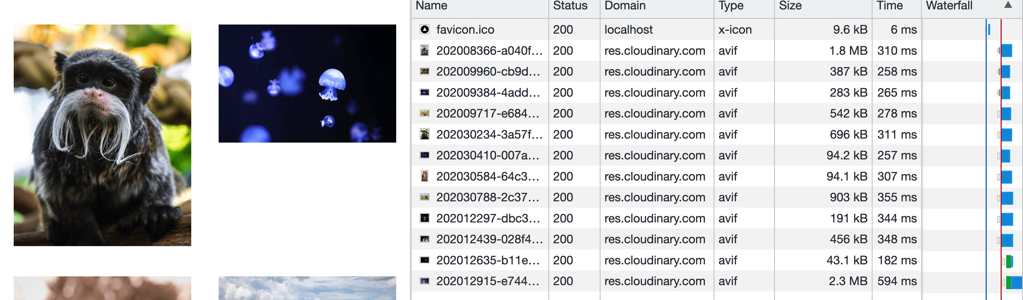
Once we reload the page, if we first inspect the resulting HTML, we can see we have a huge list of image URLs in our resulting img tag!
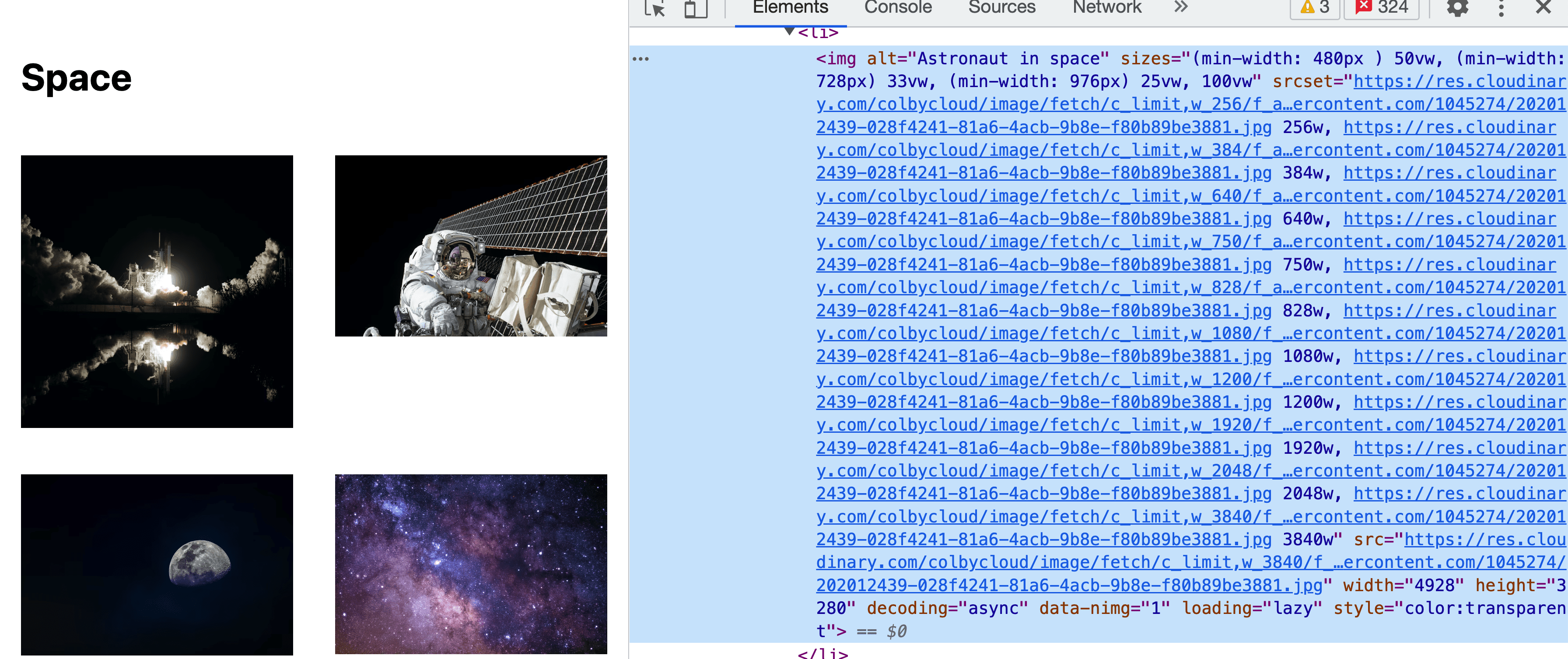
We’re seeing all of our breakpoints dynamically generated!
We’re also seeing each Cloudinary URL with dynamic widths passed in, which will serve us smaller-sized images responsively.
And we can see the results of this by opening up our Network inspector.
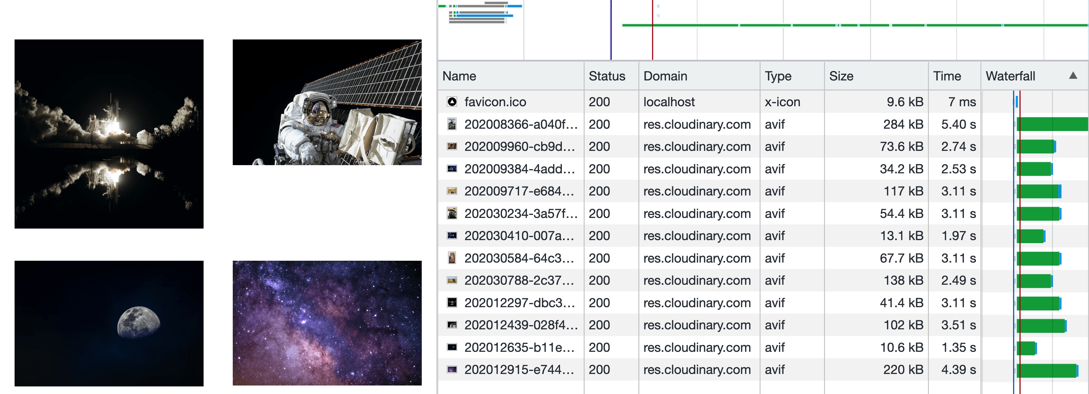
That’s a drastic reduction in size.
If you’re following along, we started at about 9mb and when viewing on a screen-size about 478px wide (what’s in my screenshot), we reduced it down to 1.2mb in total!
This is critical, especially for mobile devices that don’t have super fast internet, so they’re not stuck waiting really long times to download huge images, also wasting precious bandwidth.
Next we’ll learn how to format these images to the same shape and size, creating a uniform look and avoiding awkward whitespace.
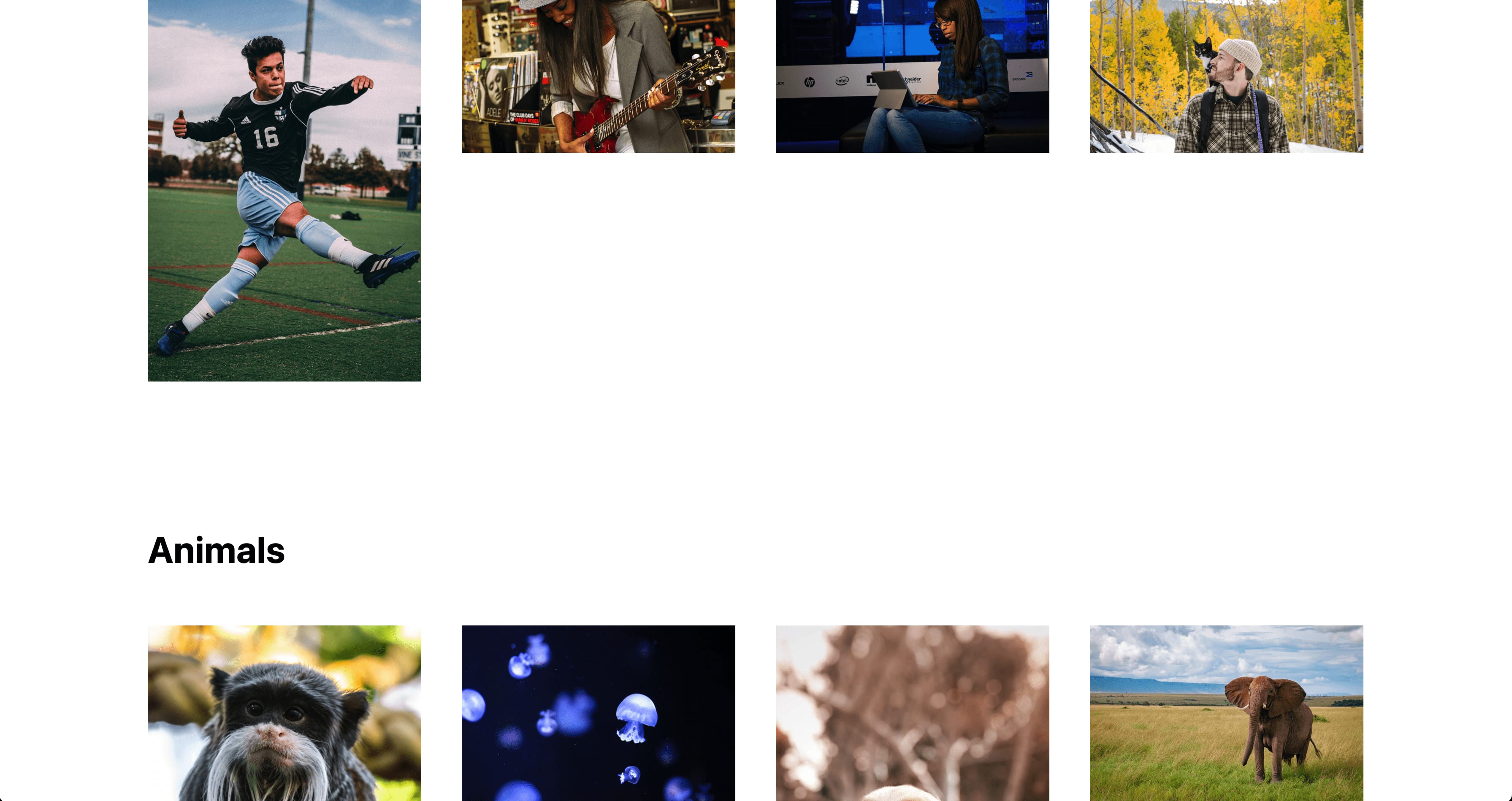
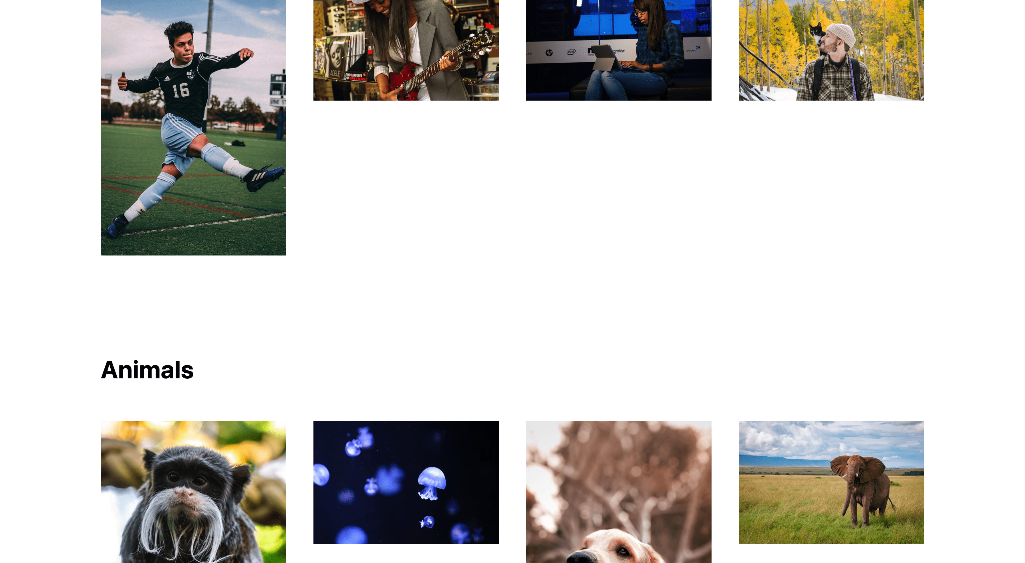
Step 4: AI-based Cropping for uniform image sizes with CldImage
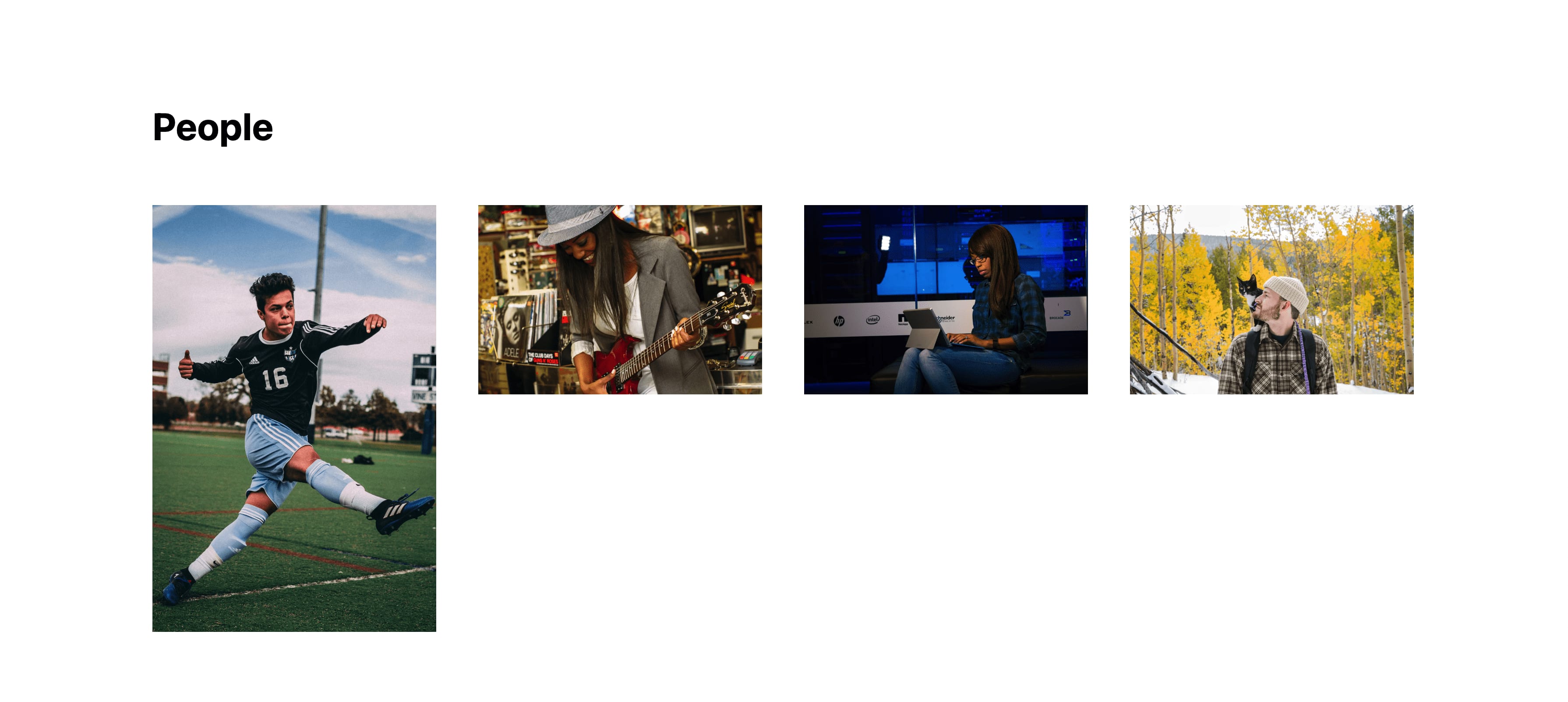
The images we’re serving come in a variety of sizes, some being tall, some being wide, maybe one in a more square shape.
But we want all of these images to look the same.
This is especially important when showing grids of images or when you want to use really specific sizing or aspect ratios within your application.
We can easily do this with CldImage, where we can first define a width and height that gives us a 1:1 ratio like:
<CldImage
  ...
  width="600"
  height="600"
Tip: because we’re using responsive images, the sizes you use really don’t matter much, as the responsive size generator will determine the actual size!
If we reload the page though, we’ll notice nothing happened.
By default, CldImage uses a “crop” method of “scale” meaning it will preserve the aspect ratio of the image by only using the width. This is to try to avoid incorrectly distorting images.
To fix this, we’re going to set a “crop” method of “fill” which will work similar to the CSS background-size: cover where it will fill the space available, cutting off or cropping the part of the image that’s too tall or too wide.
So on our CldImage instance add the crop prop:
<CldImage
  ...
  width="600"
  height="600"
  crop="fill"
And all of our images now update to squares!
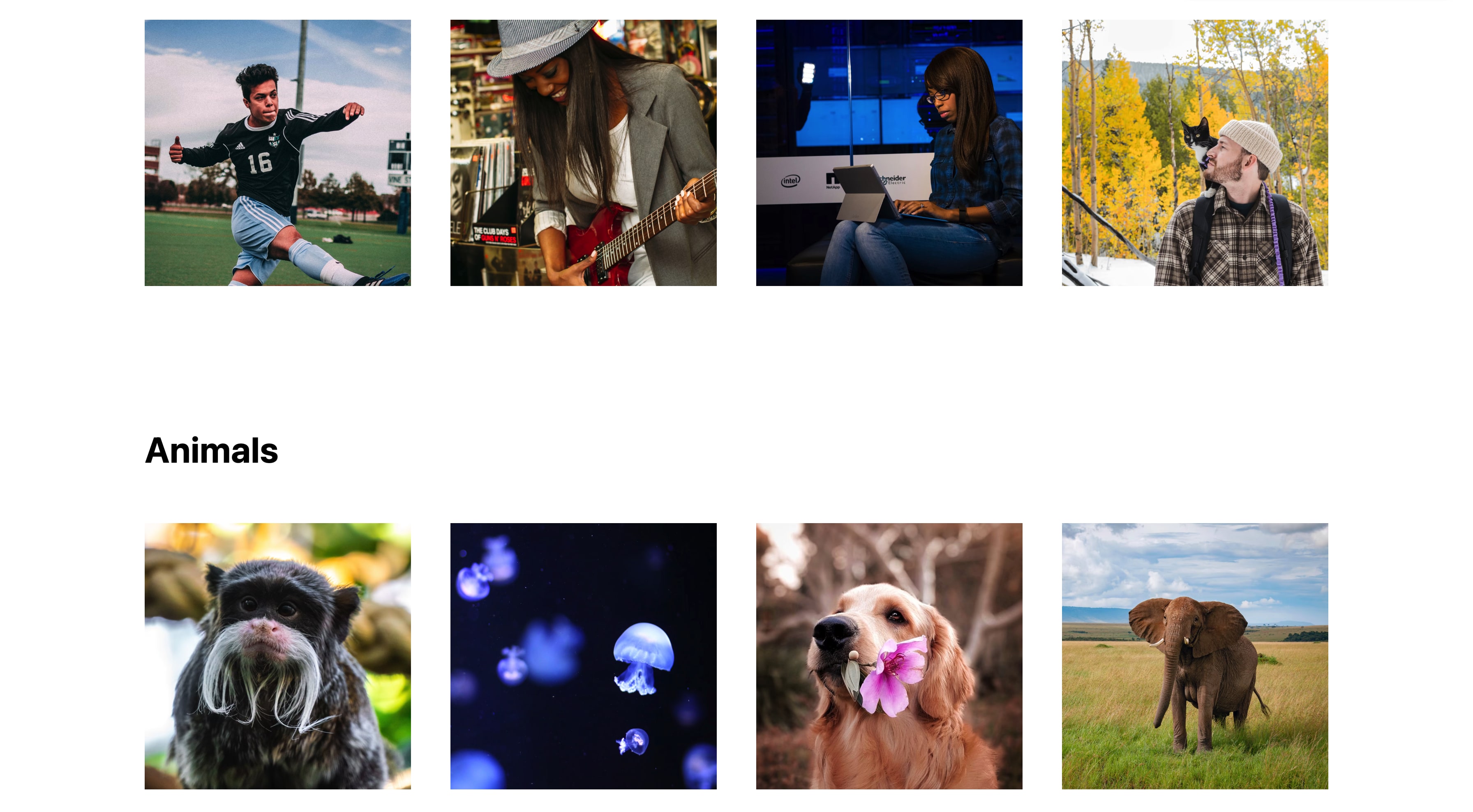
If you take notice of how these images were cropped, all of the “subjects” of these images are towards the center as much as reasonable possible.
CldImage uses a gravity of “auto” by default, using AI to determine where the subject is, and set the crop focus accordingly.
This makes it super easy to manage a bunch of images in an app, where you don’t know how they’ll look.
Tip: you can test out how this works by setting the prop of
gravityto other values likecenter(Cloudinary default) orsouth_east(or other compass directions).
What else can we do?
Change the colors of images
We can use props like tint, grayscale, brightness, and colorize to achieve the color effects we want.
See the docs for a full list of available props as well as a bunch of live examples.
Add image and text overlays
Not only does CldImage support delivering images, we can also add images or text on top!
Using Cloudinary overlays, we can easily add some text or a graphic, such as a Sale badge in an online store, to help deliver more value to our visitors (or just have some fun!).
Learn about image overlays and text overlays on the Next Cloudinary docs.