
What is modal or dialog?
Modals and dialogs are similar UI patterns, but with slightly different behavior.
They’re both a means of presenting information to a user and technically both are considered to be a dialog, where perhaps you could describe them as modal dialogs and nonmodal dialogs.
Dialogs are intended to present information while allowing interaction with the rest of the page, where modal dialogs are intended to interrupt interaction and prevent someone from interacting until its dismissed.
In our case, we’re interested in creating a modal dialog, which you might have also seen called a lightbox.
What’s new with Dialog?
For years, we would often see new libraries popping up that would try to approach creating lightboxes in a different way. Some even paid which you could likely still find around the web.
But no longer do we have to install complicated, bloated libraries in order to drop one into our app — browsers now ship with a native Dialog element!
The Dialog element comes pre-built allowing us to use it in both a modal and non-modal style, with the ability to customize it to our liking.
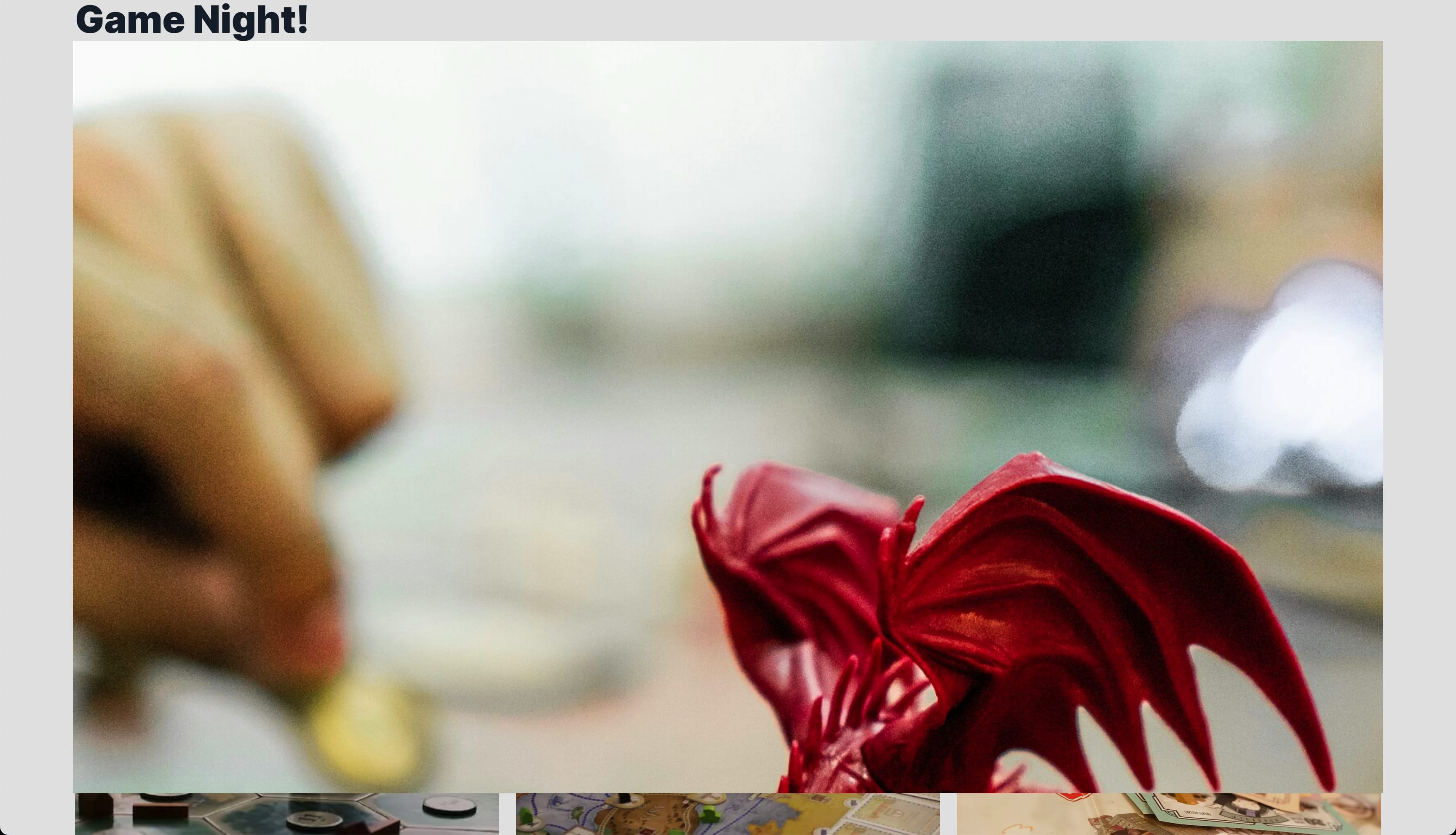
What are we going to build?
We’re going to create a pop-up modal dialog in React. To do this, we’re going to use the native HTML dialog element and customize it around that.
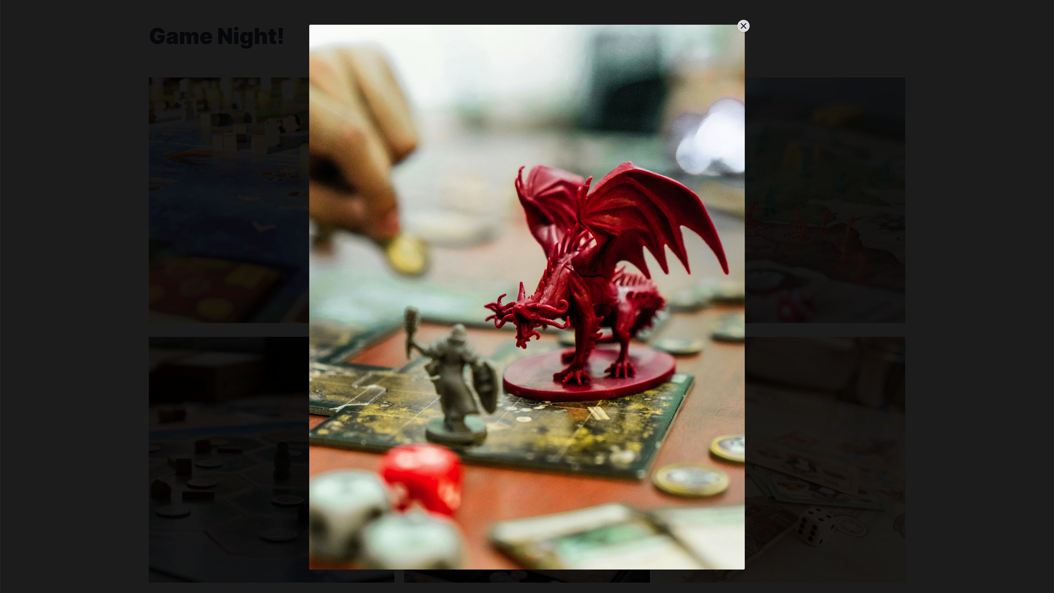
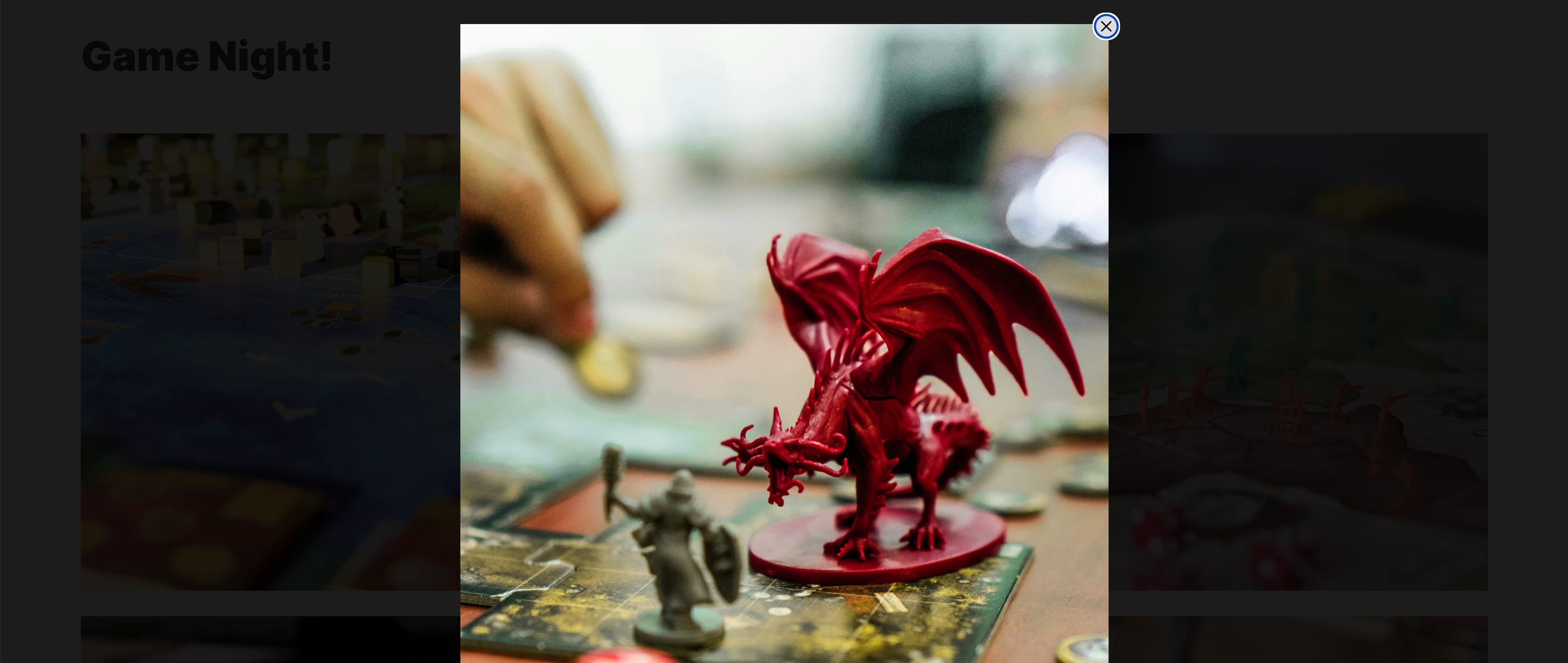
For my demo I’ll be building a photo lightbox modal, so that when you click an image, it displays the full sized image in the modal, but you can add whatever content you’d like inside!
While the dialog element is relatively new, it has pretty great support for modern browsers, so it should be pretty safe to use at this point.
Step 0: Creating a new React app
For this tutorial, we’re going to work with native React APIs, so really you can use any React environment you’d like.
I’m going to use Next.js to help show some of the pain points when dealing with server rendering!
If you want to start with Vite, you can spin up a new application following the steps in their documentation
Alternatively, if you want to use Next.js, you can check out their installation docs.
I’m also going to be using Tailwind for handling any of the styling in the app, so if you’d like to follow along with that, you can add Tailwind with Vite, Next.js, or others.
Step 1: Displaying a Modal in React with the HTML Dialog Element
The dialog element makes it really straightforward for adding a modal to any application. To start, we’ll want to simply drop in a new dialog element into our page.
This can theoretically be anywhere in your app as long as you have the APIs available to interface with it throughout the different components, but for our example, we’ll stick with dropping the dialog element in the same file as our content.
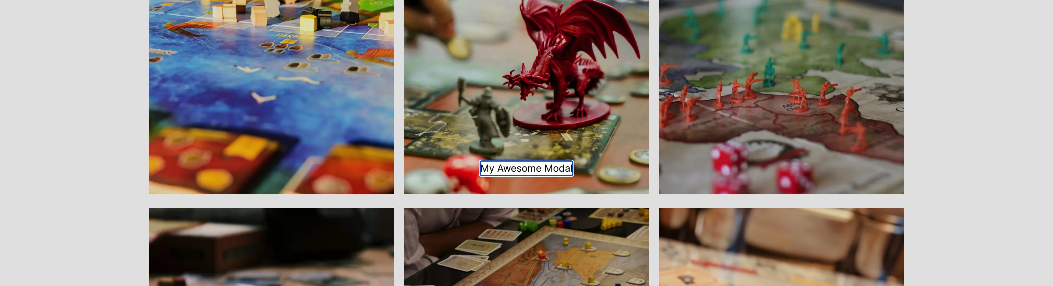
My demo is going to be an image gallery with a modal that shows the full sized image on click, so I’ll start off by adding the dialog element right below my list of images:
<dialog>
  My Awesome Modal
</dialog>
The browser actually ships with HTML-only ways to open this modal without using JavaScript, which is wild! But we’ll be doing some more advanced usage that will require JavaScript, so we’ll just dive right in with that.
To open the dialog, we’ll need to access the dialog node’s showModal method, so to access that, let’s set up a ref on our dialog element.
First, at the top of the page, import useRef with:
import { useRef } from 'react';And at the top of the page component, set up a new ref instance:
const dialogRef = useRef<HTMLDialogElement | null>(null);Now if you tried to save and reload the page, you might have noticed that you’re getting an error if you’re using the Next.js App Router or other server component-capable framework!
In order to use refs and other clientside features we’ll be using, we need to make this a client component (as opposed to a server component).
So let’s add the following to the top of our component:
"use client";Tip: You can later abstract this dialog component to avoid turning the whole page or component into a client component. Learn more about “use client”
We then need to apply that ref to our dialog, so update the dialog element to:
<dialog ref={dialogRef}>And now, we can start to access our ref to trigger our modal popup.
To do this, we can add an onClick handler to a button that we want to use to open our modal. In my case, I want to wrap each image with that button that will ultimately trigger the modal.
So let’s add a button such as:
<button>
  <Image ... />
</button>
Tip: This doesn’t have to be an image, your button can be whatever you want!
Then on our button, we want to add our onClick handler which will access our dialog element and trigger it to open:
<button onClick={() => dialogRef.current?.showModal()}>And if you head to the browser and click on your button (or image), you should see a modal pop up!
Note: If you’re unsure how to close this, you can hit the ESC key. We’ll add more ways later!
It’s crazy that we’re able to do this without pulling in a library. It’s exciting times with modern browsers.
But let’s move on.
We want this to not just show some static text, we want this to show the image that we clicked, so let’s update this to dynamically show the image we choose.
Step 2: Displaying Dynamic Modal Content in Dialog
Our modal currently just displays some text, but we want it to dynamically display information based on the item that we’re clicking.
While this won’t always be the case, maybe you do want it to be static, generally having a dynamically driven modal like this can be more practically useful in applications.
To do this, we’re going to switch how we’re opening our modal, where instead of immediately opening it upon button click, we’ll first store which button was clicked, and upon selection, update the modal content, then proceed to open the modal itself.
Let’s first create a new instance of state to store our selected item.
First import useState from React:
import { useRef, useState } from 'react';And create the state instance, where in my case I’m storing an image value so I’ll use activeImage as my designation:
const [activeImage, setActiveImage] = useState<Image>();Note: I have my Image defined elsewhere in the component. If using Typescript, be sure to update that to the type that makes sense for your state.
Now that we have our state, let’s store the selected image:
<button onClick={() => setActiveImage(image)}>If you try logging out activeImage or your state value, you should see that once you start clicking some items, you’ll see that value in the web console.
With that stored, we need to first use that value to render our full sized image in the modal and then watch for that value to change and upon change, trigger the modal to open.
Let’s first update out Dialog element to include our image:
{activeImage && (
  <Image
    width={activeImage.width}
    height={activeImage.height}
    src={activeImage.path}
    alt=""
    unoptimized
  />
)}
Note: I’m using
unoptimizedso I can show the raw image. Alternatively, you could show responsive images here as well (just in a bigger size) and include a download button for the full thing.
To watch for changes, we can use a useEffect hook.
First import useEffect from React:
import { useRef, useState, useEffect } from 'react';Then we can define our hook:
useEffect(() => {
  if ( !activeImage ) return;
  dialogRef.current?.showModal();
}, [activeImage]);
Where here we define useEffect with a dependency of activeImage, so that our hook fires every time that state object changes. When it does change, if we don’t have a value, just return, but if we do have a value, pop open the modal.
And we can now see if we start to click and close our modal (ESC) we’ll get a different image or value depending on the one we click!
Now that our modal is working, let’s start to work on the content.
I’m currently using an image as my content and if the image is too big, it creates scrollbars and isn’t great for usability, so let’s make sure we can contain the size and content of the modal.
Step 3: Styling the Dialog Element with Tailwind CSS
There are two problems we need to solve with styling our Dialog:
- Prevent the content from overflowing (large images)
- Customize the backdrop (currently an opaque black)
The first one is highly dependent on the content. If you have a few sentences and maybe a button, this doesn’t matter as much, but this will still help you be able to define a consistent width and height, as having modals of various sizes can be a bit jarring in experience.
So to start, in my case, I’m going to define a max width and height rather than a static width and height because I want my image to take up a lot of space, just not ALL the space, but you can make these values static.
Inside of our dialog, I’m going to add a wrapper Div around my image:
<dialog ref={dialogRef}>
  <div>
    {activeImage && (
      <Image
        width={activeImage.width}
        height={activeImage.height}
        src={activeImage.path}
        alt=""
        unoptimized
      />
    )}
  </div>
</dialog>
Now the tricky thing is we want to be able to support images that are tall, wide, and square. This is challenging because we can’t provide a CSS property that magically contains it both on the x axis and the y axis, so we need to specify the shape we want the container to hold (the image shape) and then set our maximum values that the shape can expand to.
Note: If you’re just using text content inside of your modal, you probably don’t need to do this, but it’s an interesting way to solve this problem, so still worth taking a look!
First, we want to set a maximum value our container can expand to. If you’re fine with the padding around the modal “as is”, you could probably do without it, but I’d like a little extra breathing room, so first I’ll add a max width and height to the inner Div:
<dialog ref={dialogRef}>
  <div className="max-h-[90vh] max-w-[90vw]">
If we open up the browser and open the modal, we’ll see that it’s just a little bit extra padding around the edges.
The issue is, we can’t see all of our image. We can scroll to see it, but that’s a pretty poor UX, so let’s make sure we’re always showing the whole thing.
To do this, we’re going to define an aspect ratio using CSS, but we’re going to use dynamic values provided by our activeImage. We specifically need to do this using the style prop, because Tailwind can’t know all of the possible variations that we could apply when on the client.
So on the Div, let’s also add our dynamic aspect ratio:
<dialog ref={dialogRef}>
  <div
    className="max-h-[90vh] max-w-[90vw]"
    style={{
      aspectRatio: activeImage && `${activeImage.width} / ${activeImage.height}`
    }}
  >
And now when we start to open our various modals, we’ll see that our image retains its shape and takes up as much space as possible, within the bounds of 90vw or 90vh!
Next, currently the only way to close our modal is with the ESC key, which while works, can be a bit frustrating if you’re not used to that pattern.
Let’s also add a button that people can easily click to escape, without Escape!
Step 4: Adding a Close Button to a Dialog
To add a close button, we’re going to simply render out a button within our Dialog element and use the Dialog’s close method to dismiss it.
Starting with the button itself, let’s add a button as an immediate child of the Dialog, adjacent to our inner div:
<dialog ref={dialogRef}>
  <div ... />
  <button className="flex items-center justify-center w-5 h-5 bg-zinc-200 rounded-full shadow">
    <svg className="w-4 h-4 text-zinc-900" xmlns="http://www.w3.org/2000/svg" width="24" height="24" viewBox="0 0 24 24" fill="none" stroke="currentColor" strokeLinecap="round" strokeLinejoin="round" strokeWidth="2">
      <path d="M18 6L6 18M6 6l12 12"></path>
    </svg>
    <span className="sr-only">Close</span>
  </button>
</dialog>
Here, I’m including some styles on the button to make it look like a circled X, an X SVG icon with some styles, and a span that includes Close that will be available for screen readers only.
For the X icon, I’m using Lucide, which is also available as a React package, but you could easily swap the icon out for whatever you’d like.
If we open up our modal, we should see it appear at the bottom, under our content. That means it’s working, but just not quite in the right spot.
So let’s reposition it, where in my case, I want to put it in the top right corner.
First, we need to set up relative positioning on the dialog:
<dialog ref={dialogRef} className="relative">Then we can set up absolute positioning on our button:
<button className="absolute -top-2 -right-2 z-1 ...">If we take another look in the browser, we notice we now have an issue. It’s in the top right corner, but it’s getting cut off.
It seems that by default, overflow is hidden from the dialog element, so we can simply tell it to make it visible:
<dialog ref={dialogRef} className="relative overflow-visible">And we can readily see it appear!
Note: When trying to research if making the overflow visible would have adverse effects, I couldn’t find anything of note. It may be there to correlate with the default behavior to make the content scrollable, where we’re defining styles to contain it, which wouldn’t apply to us.
Now that our buttons where we need it, let’s actually make it work!
When we close our dialog, we actually want to do two things:
- Close the modal (of course)
- Reset state
If we don’t reset our state, we’ll end up with a bit of a buggy behavior, where if we try to reopen the same image twice, it will get stuck.
So let’s first define a close function since we’re doing more than one thing:
function closeDialog() {
  dialogRef.current?.close();
  setActiveImage(undefined)
}
Where here, we’re attempting to run the close method on our dialog element then resetting our activeImage state.
Then, we can define an onClick handler on our button to invoke it.
<button
  className="absolute -top-2 -right-2 z-1 flex items-center justify-center w-5 h-5 bg-zinc-200 rounded-full shadow"
  onClick={() => closeDialog()}
>
And once we try it out in our browser, we can see that it’s reliably closing our dialog!
Next issue, is when the modal is open, we can still scroll the page! The definitely isn’t a great experience and can confuse people who accidentally scrolled down, so let’s see how we can lock the screen and prevent scrolling.
Step 5: Preventing Scrolling when Modal is Open
In order to prevent scrolling, we’re going to simply use a little bit of CSS, but we’ll need to apply it dynamically using JavaScript.
What we’ll do, is whenever we show the modal from within our useEffect, we’ll access the document body’s style property to apply what we need.
Inside our useEffect under showModal, add:
useEffect(() => {
  if ( !activeImage ) return;

  dialogRef.current?.showModal();

  document.body.style.overflow = 'hidden';
}, [activeImage]);
Here we’re setting an overflow of hidden on our body, which simply locks it in place!
So if we try to scroll after our modal is open, we can’t.
But if you open and the modal and try to use your app afterwards, you might notice something, you still can’t scroll! So we need to also remove the overflow of hidden whenever the modal closes.
To do this, we’re going to listen for the modal’s close event with an event listener, which allows us to trigger a function, in this case, remove our overflow.
Because we only need this event listener when we have an active image, we can use our existing useEffect to manage it.
At the bottom of our useEffect add:
dialogRef.current?.addEventListener('close', closeDialog);We’re listening for the code event on our dialogRef that we set up earlier and when it triggers, we’re invoking the closeDialog function from earlier, which of course closes the dialog (which could be redundant) and also clears state.
Then below it, still inside of the useEffect, add this return function:
return () => {
  dialogRef.current?.removeEventListener('close', closeDialog)
}
Tip: It’s important that the removeEventListener references the same function!
useEffect hooks allow you to return a function which serves as a “cleanup” for the effect, essentially allowing to trigger something whenever the dependency that triggered the original effect is no longer active.
So at this point, your useEffect should look like this:
useEffect(() => {
  if ( !activeImage ) return;
  dialogRef.current?.showModal();
  document.body.style.overflow = 'hidden';
  dialogRef.current?.addEventListener('close', closeDialog);
  return () => {
    dialogRef.current?.removeEventListener('close', closeDialog)
  }
}, [activeImage]);
If you head to the browser and try to scroll after opening a modal, it’s still not fixed, but let’s remove our overflow from within our closeDialog function:
function closeDialog() {
  dialogRef.current?.close();
  setActiveImage(undefined);
  document.body.style.overflow = '';
}
Note: If you have an overflow value already on your body element, it’s important that you re-add the same value, but there isn’t an overflow value by default which is why we don’t have to here. You can do this by temporarily storing the value in a variable or ref while the modal is open!
And if we head to the browser, open the modal then close it, and try to scroll around, we can!
Next, let’s see how we can customize the modal a little bit with some extra styles.
Step 6: Customizing the Dialog Modal with Tailwind CSS
The default Dialog works pretty well and looks okay, but we can customize it to fit the UI or theme of our own site, or generally just however we prefer it to look!
To start, I like my modal backdrops to be a bit darker, but there isn’t a DOM element to apply it do in our component.
We can use the ::backdrop psuedo element to apply our styles!
On our Dialog, let’s add a new class of:
<dialog ref={dialogRef} className="... backdrop:bg-black/85">This applies a black background, but keeps it at 85% opacity.
And if we open our modal, we should now see it’s a bit darker! Which is especially helpful when previewing images.
As another thing, and this is me just being picky, I personally to prefer how sharp the edges of the modal are (square), so I like to ever so slightly soften them by rounding them just a tiny bit.
On our Dialog’s inner div, where we’re already applying a max width and height, we can add a class to round our corners:
<dialog ... >
  <div className="... rounded-sm overflow-hidden"
We also add an overflow of hidden to make sure it actually is able to round our container and the container’s content.
But we have a tiny issue.
It’s hard to see, easier if you increase how round the corners are, but the white background of the dialog is leaking through!
To fix this, we can simply set the background of our Dialog to transparent:
<dialog ref={dialogRef} className="... backdrop:bg-black/85 bg-transparent">If you prefer to keep a background, you can add a black background, or whatever color you’d like, to our inner div:
<dialog ... >
  <div className="... rounded-sm overflow-hidden bg-black"
And with that, we should see our nice clean corners!
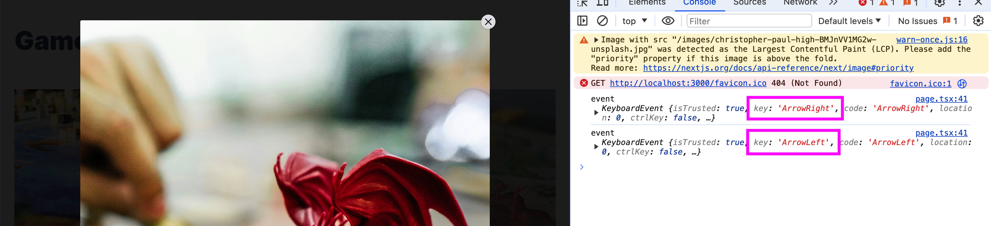
Step 7: Changing Modal Content with Keyboard Navigation
In my use case, I’ve been showing full sized images inside of a modal as part of an image gallery. One thing I like with this pattern is giving people the ability to navigate through this list of images using the right and left arrow keys, rather than having to keep clicking back and forth.
Because we’re already dynamically changing our modal content based on active image, we can determine what the index of our image is based on state, and look for the next or previous one based on its position!
To do this, we’re going to use a similar mechanism to our close and add an event listener, but this time on the document, and listening for a keyboard event.
Let’s first create a new function to handle our events:
function handleOnKeyDown(event: KeyboardEvent) {
  console.log('event', event)
}
And then we can set up our event listeners in the same useEffect we’ve been using based on if we have an activeImage.
useEffect(() => {
  ...
  document.body.addEventListener('keydown', handleOnKeyDown);
  return () => {
    ...
    document.body.removeEventListener('keydown', handleOnKeyDown);
  }
}, [activeImage]);
Here we’re using the keydown event to determine when our keys were pressed.
If we open up our modal and hit any key, we should see a console log, but let’s specifically look for the left and right arrow keys, which we can determine with the code property on the event.
We can watch for these keys, and if we see them, update our active image accordingly.
So let’s set up our conditional statements first:
function handleOnKeyDown(event: KeyboardEvent) {
  if ( event.code === 'ArrowRight' ) {
    console.log('arrow right')
  } else if ( event.code === 'ArrowLeft' ) {
    console.log('arrow left')
  }
}
And before we can find out what image to set, we need to find the current image’s index relative to our full list of images.
At the top of handleOnKeyDown add:
function handleOnKeyDown(event: KeyboardEvent) {
  if ( !images ) return;
  const currentIndex = images?.findIndex(({ path }) => path === activeImage?.path);
  if ( typeof currentIndex === 'undefined' ) return;
Note: replace
imageswith whatever you’re using to maintain your list of items that you’re navigating through, where in my case, I have a list of images.
First, to make Typescript happy we first make sure images actually exists, then we look for the index of our activeImage that we’re maintaining in state relative to that list.
Note: In my example, I’m using
pathto find the index because I don’t have a better identifier, but you should consider using a unique identifier to make sure you don’t potentially have duplicate values of that property.
But finally, if we don’t have a current index, we return, where we explicitly check if it’s undefined, to avoid a 0 value causing a return.
If you log out out that value, you should be able to see we dynamically get the current images index depending on which one you have open!
But now we can use that, along with which key is pressed, to find the next or previous image to show.
In order to do this, we’ll need to have special conditional checks based on the arrow direction, so starting with the right arrow, we can add:
if ( event.code === 'ArrowRight' ) {
  if ( currentIndex + 1 < images.length ) {
    const nextImage = images[currentIndex + 1];
    setActiveImage(nextImage);
  } else {
    const nextImage = images[0];
    setActiveImage(nextImage);
  }
Where we take our current index, add 1, and compare it to the length of the total resources, which lets us check to see whether or not we’re at the end of the array. If we’re NOT at the end of the array, we grab the next image by simply adding one to our index, but if we ARE at the end of the list, we grab the first one to wrap back around to the start.
Tip: We add 1 to our current index when comparing because indexes start at 0 to reference the first spot as opposed to length which starts with 1 to reference the first spot.
And if we head to the browser, open the modal, and hit the right arrow, we should be able to scroll through them, all the way to the end, and back to the start!
So now let’s take care of the left arrow, which will be similar:
} else if ( event.code === 'ArrowLeft' ) {
  if ( currentIndex !== 0 ) {
    const nextImage = images[currentIndex - 1];
    setActiveImage(nextImage);
  } else {
    const nextImage = images[images.length - 1];
    setActiveImage(nextImage);
  }
}
Where this time, we only care about if the current index is 0, meaning we’re at the first beginning, and if we’re NOT at the start, we remove 1 instead of add one, to go back an item, but if we ARE at the beginning, we grab the very last item by using the length of the array minus 1.
And if we go back to the browser and this time hit the left arrow key, we should see us go the previous items!
While this is certainly a use-case specific feature, it can be really helpful from a UX perspective to allow your visitors to more easily navigate around your content.
What else can we do?
Add arrow buttons for clicking to navigate through a list
If you added the left and right arrow key capability, we’re now limiting our feature to people who happen to try hitting left or right. We can further enhance this by adding buttons in the UI to allow anyone to click through.
Add a left arrow and right arrow buttons on the sides, similar to how we added a close button, then invoke our navigation logic based on which one is clicked!
Close the modal when clicking outside of the content
One thing that can be a bit annoying is not being able to easily close a modal, or any type of UI.
I believe, for a good UX, being able to click the backdrop or outside of the modal content should dismiss the modal, unless you have a good use case such as a working form.
So next, learn how to close the modal when clicking outside.
How to Detect Clicks Anywhere on a Page in React
Warn user before closing modal to prevent data loss
If you’re sticking a form in your modal, which depending on the use case is questionable in the first place, you want to make sure that if someone accidentally hits close or ESC, they’re not going to lose all of their changes.
We can use the browser APIs to warn users if thats the case, so that we can help them avoid that issue.
Warn Users When Leaving a Page in React with beforeunload (YouTube)