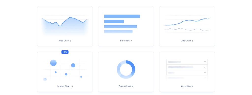
Data runs the world, but to effectively use that data, you need a way to visualize it. How can we easily spin up beautiful data dashboards in React with Tremor?
What is Tremor?
Tremor is a component library built on top of popular CSS framework Tailwind that gives a set of building blocks that help to make it easy to build data dashboard in React apps.

Tremor works with a few different frameworks, including Next.js, but we’ll be focusing simply on React for this tutorial.
While the star of the show is data, Tremor helps to present that data in a way that’s easy to consume and visually appealing.
What are we going to build?
We’re going to start off with a fresh new React app using Vite.
We’ll learn how we can set up Tremor along with Tailwind and use Tremor’s component library to easily scaffold a new dashboard.
Step 0: Creating a new React.js application
We’ll be working inside of a React.js Typescript application. You can either join in with your existing project or create a new app using Vite.
To follow along, in your terminal, run:
npm create vite@latest my-barbenheimer-dashboard -- --template react-tsNote: If you don’t want to use Typescript, you can update the template in the previous line to
react.
You can then navigate to that project:
cd my-barbenheimer-dashboardInstall the dependencies:
npm installThen start your development server with:
npm run devAnd your project will now be available at http://localhost:5173/!

Now as we’re dealing with data for this, it might be helpful to have some data to use for our visualizations.
I cut together some Barbie and Oppenheimer data based on Box Office Mojo and The Movie Database’s API which you can find and copy into your project yourself here:
https://gist.github.com/colbyfayock/95d9937fabdd61849adc40a5da76dfa1
I’ll be using the following filenames stored inside of the src directory:
Step 1: Installing Tailwind in a React Vite app
Tremor uses Tailwind in order to build its components and with that, we need to also install Tailwind to our project.
If you already have Tailwind installed, you can skip this step.
If you’re not following along with Vite, you can find how to install Tailwind on their docs.
Note: the following is basically the same steps you can find on the Tailwind Docs for React apps!
First install Tailwind and its dependencies:
npm install -D tailwindcss postcss autoprefixerThen initialize Tailwind:
npx tailwindcss init -pUpdate your Tailwind config file pointed at your template files:
export default {
  content: [
    "./index.html",
    "./src/**/*.{js,ts,jsx,tsx}",
  ],
  ...
}
Add the Tailwind CSS directives at the top of your global CSS file, in our case is src
@tailwind base;
@tailwind components;
@tailwind utilities;
And now, if you use Tailwind in your project, such as:
<h1 className="text-3xl font-bold underline">
  Hello world!
</h1>
You should now see the styles applied in your app!

Step 2: Installing and configuring Tremor in a React app
Next up, is Tremor. The installation process is slightly easier.
For this, all we need to do to start is run their CLI:
npx @tremor/cli@latest initWhen prompted, select Vite if following along or whatever framework you’re using.
Once selected, Tremor will have you confirm that they’ll move forward with updating your Tailwind config, adding their required configuration to make everything “just work”.
At this point, Tremor will install its own dependencies and make changes to the configuration and once ready, we’re actually good to go, where next step, we’ll start using components!
Step 3: Adding Cards to show revenue and statistics to the dashboard
We’ll start with one of the simpler components, the Card, which is a box that allows us to add specific datapoints inside like revenue.
Part of the beauty of using Tremor is with their components, you get pretty much everything included in order to quickly scaffold the dashboard blocks you need, only needing to replace the data.
Before we drop in our components, let’s first create a spot for them to go.
Inside our app, let’s create two columns that will contain our dashboard spots.
Replace everything inside of the App return statement with:
<div className="text-left">
  <div className="grid grid-cols-2 gap-12">
    <div>
      <h2 className="text-2xl font-bold mb-6">Barbie</h2>
    </div>
    <div>
      <h2 className="text-2xl font-bold mb-6">Oppenheimer</h2>
    </div>
  </div>
</div>
This feels a bit overly nested, but we’re just prepping ahead of time for how we’re arranging the layout throughout this tutorial.
Next let’s actually add our card using the first Usage Example from the Tremor docs.
First, let’s import the Card component along with the Metric and Text components from Tremor:
import { Card, Metric, Text } from "@tremor/react";Then, drop the following below each of the movie title headers:
<Card className="max-w-xs mx-auto mb-6" decoration="top" decorationColor="indigo">
  <Text>Sales</Text>
  <Metric>$ 34,743</Metric>
</Card>
Our Card component wraps the content, which uses a Title to label the Card and Metric for the actual number we want to display.
If we look at the app, we can immediately see how easy it was to drop that in.

But we want to use actual data for this.
If you followed along with the end of Step 1, we imported data into our project that we can use.
First import that data into your project:
import dataBarbie from './movie-barbie.json';
import dataOppenheimer from './movie-oppenheimer.json';
Then we can use it to replace the Card metrics with actual data.
For Barbie:
<Card className="max-w-xs mx-auto mb-6" decoration="top" decorationColor="indigo">
  <Text>Revenue</Text>
  <Metric>${ dataBarbie.global_revenue }</Metric>
</Card>
And Oppenheimer:
<Card className="max-w-xs mx-auto mb-6" decoration="top" decorationColor="indigo">
  <Text>Revenue</Text>
  <Metric>${ dataOppenheimer.global_revenue }</Metric>
</Card>
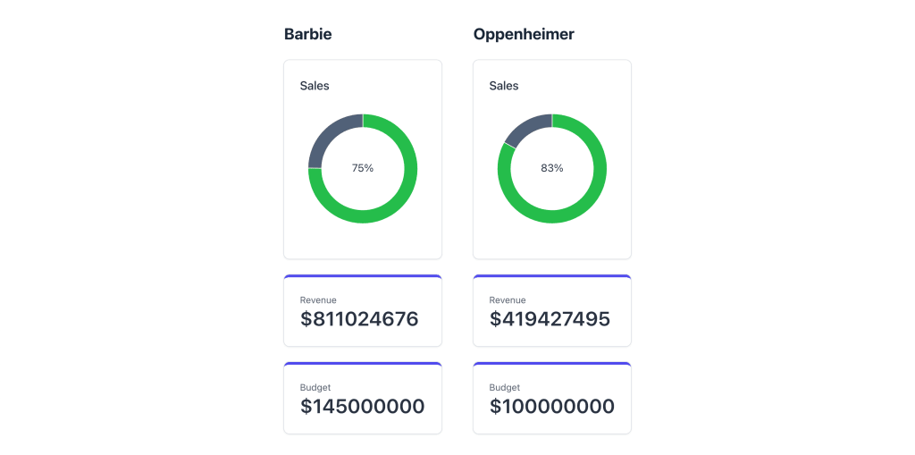
And now, if we look in the browser, we can see the data show up!

Note: For our example we’re using static imported data, but in a real world use case, you would be able to fetch or import data from a dynamic source.
We can even expand this for whatever data points we want, such as if we wanted to show the budget to see how well their investments are doing:
<Card className="max-w-xs mx-auto mb-6" decoration="top" decorationColor="indigo">
  <Text>Budget</Text>
  <Metric>${ dataBarbie.budget }</Metric>
</Card>

...

<Card className="max-w-xs mx-auto mb-6" decoration="top" decorationColor="indigo">
  <Text>Budget</Text>
  <Metric>${ dataOppenheimer.budget }</Metric>
</Card>
And we can start to see our dashboard coming together!

Step 4: Adding a donut chart to show user rating
But the Revenue and budget doesn’t tell the whole story. What do the people think of the movies?
Our data includes user ratings that give a look at the score each movie is getting based on their opinions.
A good way to show this is a 2-section pie chart, where in particular, we can use a Donut Chart to show the impact they’re both having.
Working from the Donut Chart Usage Example in the Tremor Docs, let’s first import the DonutChart and Title components, where we already have the Card component imported:
import { Card, Metric, Text, Title, DonutChart } from "@tremor/react";Next, let’s drop in our chart right under our headers, starting with Barbie:
<Card className="max-w-lg mb-6">
  <Title>Sales</Title>
  <DonutChart
    className="mt-6 mb-6"
    data={[
      {
        name: 'false',
        userScore: dataBarbie.vote_average,
      },
      {
        name: 'false',
        userScore: 10 - dataBarbie.vote_average,
      }
    ]}
    category="userScore"
    index="name"
    colors={["green", "slate"]}
    label={`${(dataBarbie.vote_average * 10).toFixed()}%`}
  />
</Card>
Here we’re wrapping our chart and a title with a card. Inside, we’re using the data source, which would typically include a few different data points and instead passing a single data point along with the difference of that point from 10, giving us a percentage-based set of numbers to create our chart.
We’re also using the label prop in order to configure the number that appears inside of the chart, allowing us to also present our user score as a percentage.
We’ll also do the same for Oppenheimer with:
<Card className="max-w-lg mb-6">
  <Title>Sales</Title>
  <DonutChart
    className="mt-6 mb-6"
    data={[
      {
        name: 'false',
        userScore: dataOppenheimer.vote_average,
      },
      {
        name: 'false',
        userScore: 10 - dataOppenheimer.vote_average,
      }
    ]}
    category="userScore"
    index="name"
    colors={["green", "slate"]}
    label={`${(dataOppenheimer.vote_average * 10).toFixed()}%`}
  />
</Card>
And with those added, we can see a bit of a twist.

That twist is Oppenheimer appears to be more favored, even if it’s not making quite as much on the revenue front!
What else can you do?
Line graphs comparing daily results
Part of the fun is seeing the daily numbers and seeing how they slowly grow together. We can use line charts (and other types of charts) to easily accomplish this with Tremor similar to how we used data for the charts we worked with here.
Learn how to add a line chart that shows the daily domestic numbers of both Barbie and Oppenheimer over on the last part of my tutorial on YouTube.
Add filters and groupings
Beyond the visuals, data dashboard are also effective in the way that people can drill down into the data or filter it based on their needs.
A good use case there is date, such as, maybe I only want to compare a few days, such as a specific weekend.
Tremor gives a bunch of UI components that also help such as the Date Range Picker and Select that give an easy way to keep a consistent UI and add more advanced capabilities.

